
Responsive UX Case Study
eFairs Custom Banner Tool
A guided banner-building experience that helped school staff create professional, branded Follett Book eFair promotional graphics without needing design software or direct designer support.
Project Highlights
Overview
The eFairs Custom Banner Tool was designed to help school staff promote their Follett Book eFair with polished, branded promotional banners.
Instead of requiring librarians or teachers to request custom design support, the tool guided them through a simple workflow where they could select a visual theme, add optional supporting graphics, preview the result, and save a finished banner.
The experience was created for both desktop and mobile use, making it accessible from the same kinds of devices school staff were already using to manage their eFair.
The Challenge
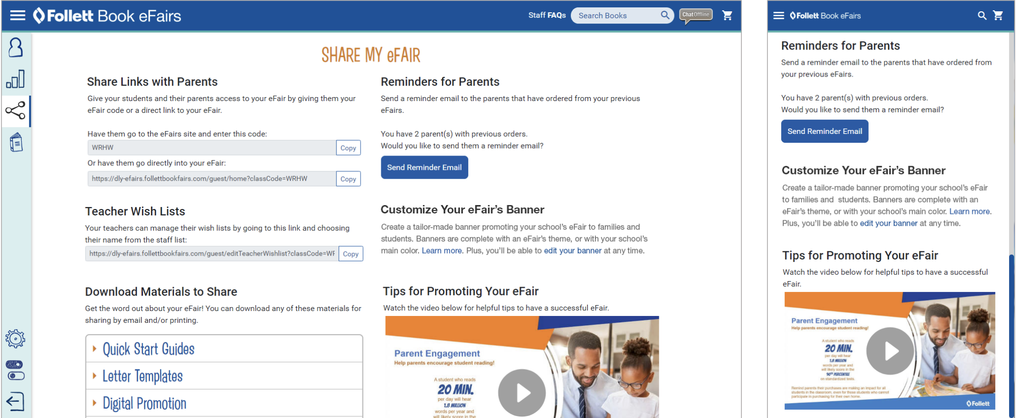
Schools needed an easy way to promote their eFairs to families and students while keeping the final materials consistent with Follett’s brand and campaign standards.
The challenge was not simply creating one banner. The real challenge was designing a repeatable system that could generate many different themed banners while remaining easy for non-designers to use.
The interface needed to balance flexibility, speed, brand control, and clarity.
UX Goals
- Make banner creation simple for users with no design experience
- Provide a guided workflow that clearly communicates progress
- Support both desktop and mobile views
- Protect brand consistency through structured choices
- Allow banners to be previewed before saving
- Enable future edits without forcing users to start over
- Support a scalable internal content-management process
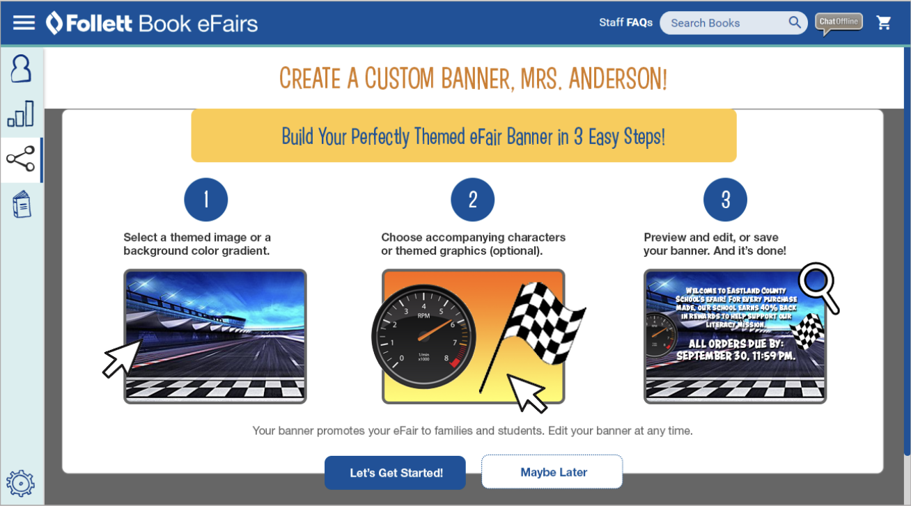
The Three-Step Experience
The user-facing banner builder was organized around a simple three-step flow.
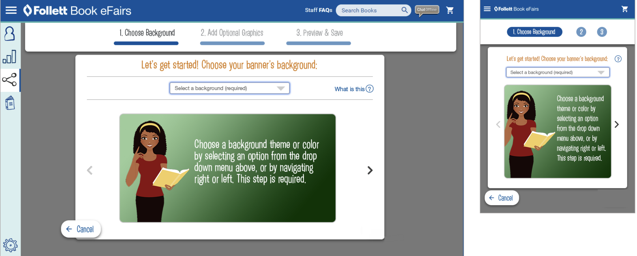
1. Choose a Background
Users began by selecting a theme image or background color gradient. This gave each banner its visual foundation while keeping available options curated and brand-safe.
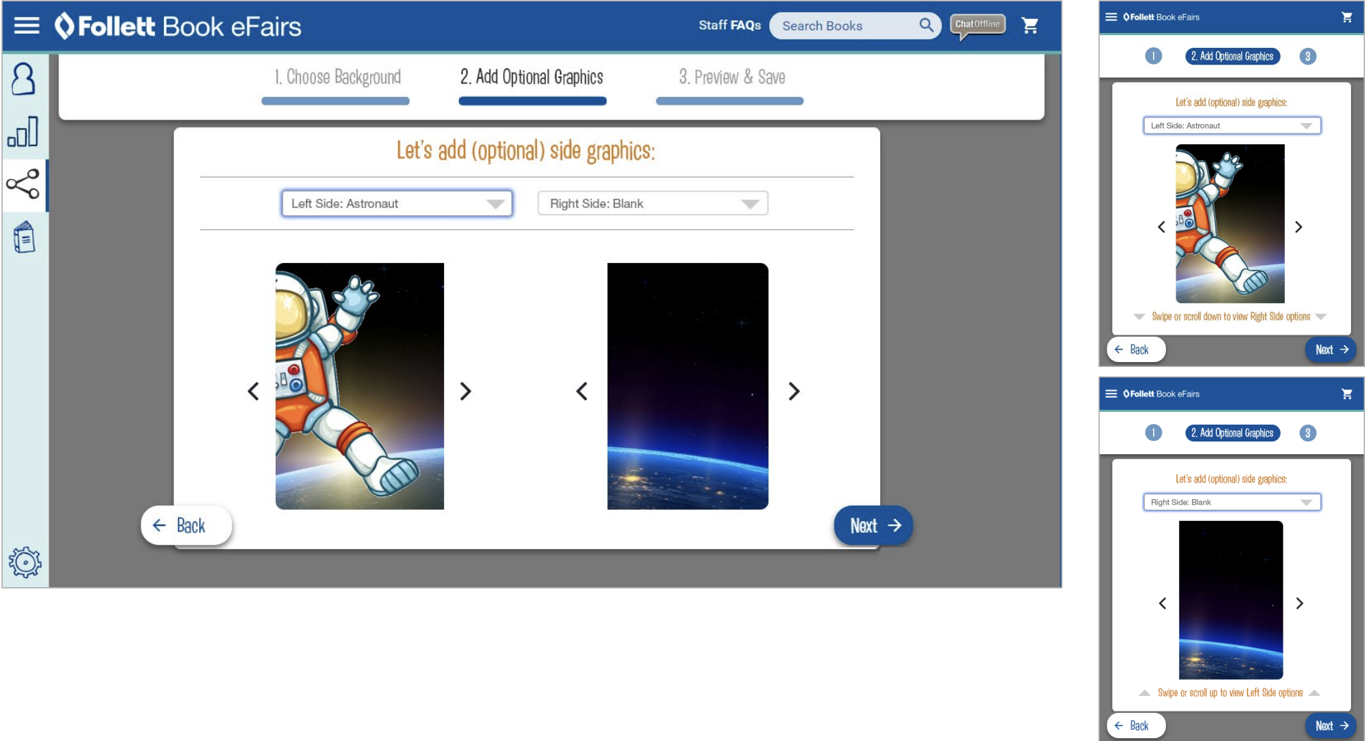
2. Add Optional Graphics
Users could then choose supporting themed graphics for the left or right side of the banner. This added personalization without opening the door to uncontrolled layout decisions.
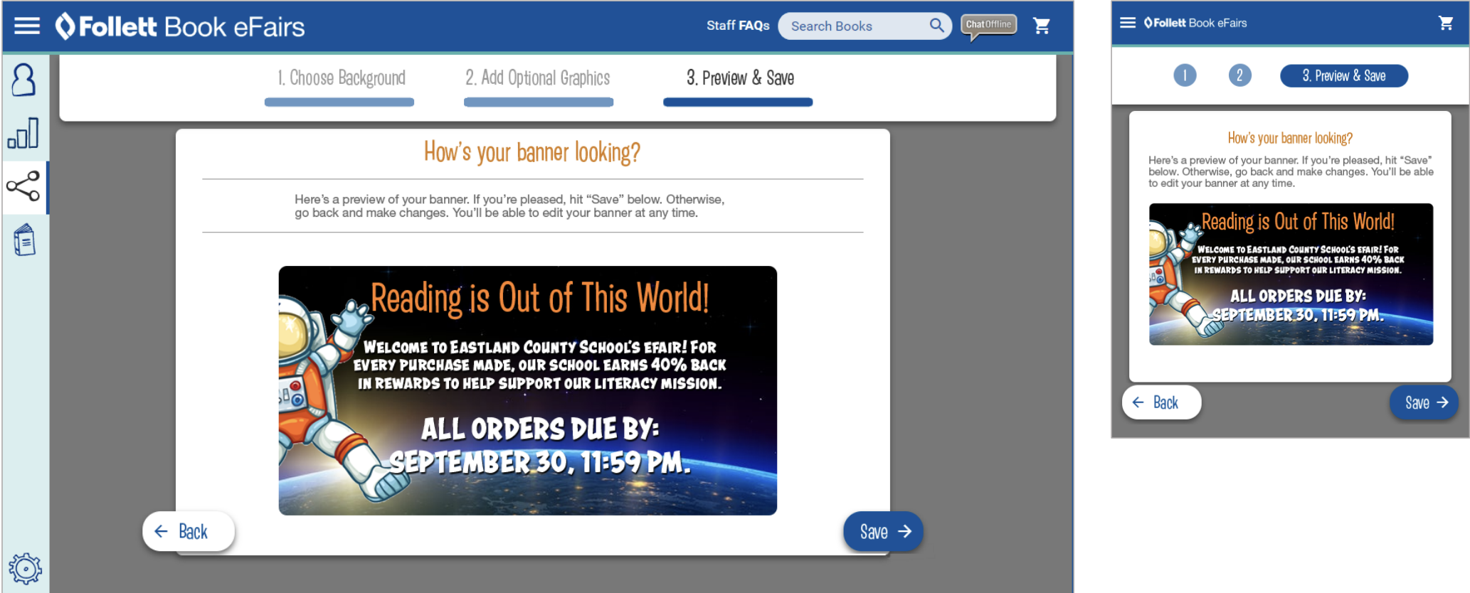
3. Preview & Save
The final step showed users how the banner would look before saving. This provided confidence, reduced uncertainty, and allowed users to go back if something needed to change.
Responsive Design
The design presentation documents desktop and mobile views throughout the experience, including the share page, promo page, and each step of the banner tool workflow.
The mobile screens required the same workflow to be simplified into a narrower, step-by-step interface without losing the sense of progress or control.
This was especially important because school staff could be accessing the tool from a variety of environments and devices.
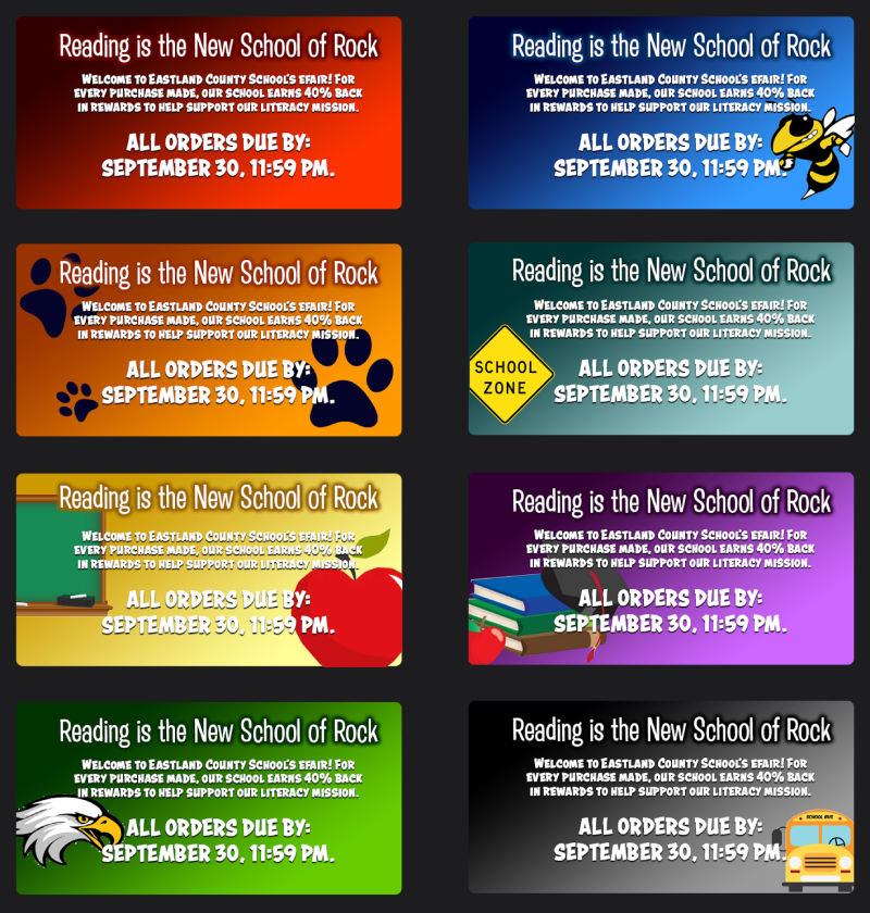
Generated Banner System
The tool was designed to produce many different banner outcomes from the same structured workflow.
Themes included seasonal, classroom, sports, adventure, school, space, beach, farm, jungle, and other educational or promotional concepts.
This made the tool feel flexible to school staff while still keeping every output constrained enough to remain visually consistent.
Behind The Scenes: Admin Tools
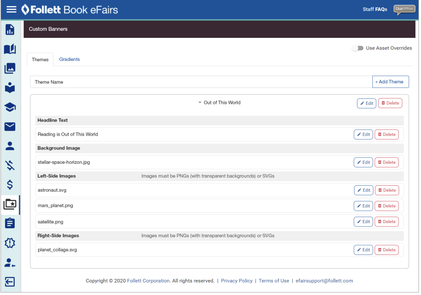
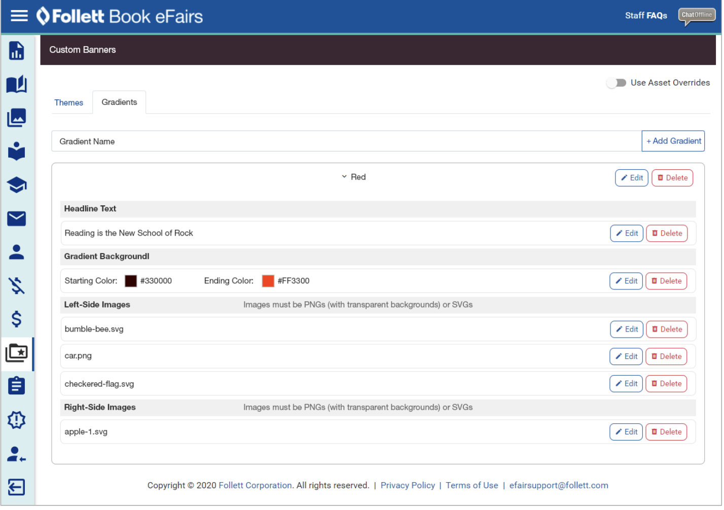
One of the strongest aspects of the project was the administrative system behind the user-facing banner builder.
The admin screens allowed Follett staff to manage themes, gradients, headlines, background images, left-side graphics, right-side graphics, and related banner assets.
This turned the project from a single-purpose banner creator into a scalable content-management system. New themes and graphics could be added or maintained without requiring a full redesign of the user-facing tool.
My Role
As Senior UX Designer, I helped shape the workflow, structure, and interaction model for the banner builder and supporting administrative experience.
- Designed the guided three-step banner creation workflow
- Supported desktop and mobile interface patterns
- Balanced user customization with brand control
- Structured the experience for non-designer users
- Helped define preview and save behavior
- Considered how content and assets would be managed behind the scenes
- Documented the experience through presentation materials
Outcome
The eFairs Custom Banner Tool gave school staff a more approachable way to create promotional graphics for their eFair.
It reduced reliance on custom design support, supported brand consistency, and created a repeatable system for generating a wide range of themed promotional banners.
The supporting administrator tools also made the system more sustainable by giving internal teams a way to manage themes, graphics, gradients, and messaging over time.
Reflection
This project is a strong example of UX design as enablement.
The goal was not to give users unlimited creative freedom. The goal was to give school staff enough guided control to create something useful, attractive, and brand-aligned without overwhelming them.
Looking back, the most valuable part of the work was the way it connected user-facing simplicity with behind-the-scenes scalability.
Good UX does not always mean giving users more options. Sometimes it means giving them the right options in the right order.
Supporting Visuals
A selection of screens from the desktop, mobile, banner builder, generated output, and administrator workflows.
Complete Design Walkthrough
The full presentation includes desktop, mobile, banner workflow, generated banner examples, and administrator tool screens.
View Presentation5.6 MB
Interested in working together?
Whether you’re building a self-service tool, improving a complex workflow, or creating a scalable product experience, I’d love to hear about it.
Get in Touch