
Information Architecture Case Study
CCH Tax & Accounting Site Redesign
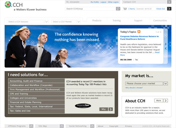
Reorganizing thousands of pages, products, and tax-related resources into a more customer-centered experience that helped professionals find information faster and with greater confidence.
Project Highlights
Overview
CCH Tax & Accounting had accumulated a large and complex website ecosystem made up of thousands of unique pages, product pages, marketing pages, and tax legislation PDFs.
Over time, the site had become organized around products and internal business structures rather than the needs of customers. For users trying to locate tax research, tax software, professional resources, or product information, the experience had become frustrating and difficult to navigate.
The redesign effort focused on moving the site from a marketing-driven collection of one-off pages toward a more customer-centered solutions provider experience.
Challenge & Opportunity
The existing site behaved like a digital version of the Winchester Mystery House: hallways and doorways that led nowhere, rooms that did not appear to serve a clear purpose, and new additions continually bolted onto an already confusing structure.
Users routinely struggled to find what they were looking for. Search was not solving the problem. Menu-walking was not solving the problem. Basic information hierarchy was not solving the problem.
When customers could not find answers online, they often contacted customer service, where frustration could increase rather than decrease.
Content Complexity
The content ecosystem was large and fragmented. Two major business segments, Tax Research and Tax Filing, were marketed differently and handled differently internally.
Each segment included more than twenty products designed to serve different customer needs. Some solutions overlapped, while others did not. The result was a splintered experience that made sense internally but confused customers.
The redesign required a more inclusive structure that brought both customer camps together under a more cohesive solutions-oriented experience.
My Contribution
As Internet Design Manager, I contributed to the full information architecture and redesign effort.
- Created and refined site maps
- Reorganized categories and content groupings
- Helped rename and clarify sections
- Designed navigation structures
- Supported page template design
- Helped shift the experience from product-centered to customer-centered
- Collaborated with a Chicago design agency and internal stakeholders
Key Design Decision
The most important decision was to stop asking users to understand CCH’s internal product structure.
Instead of organizing the site primarily around internal ownership, product silos, or competing business interests, the redesign moved toward organizing information around customer needs, market segments, and the problems users were trying to solve.
This was especially important because Tax Research and Tax Filing had long been treated as separate expertise areas, even though customers often experienced them as connected parts of a larger professional workflow.
Information Architecture Challenge
The toughest organizational challenge was bringing the two major business segments together in a way that felt inclusive, practical, and useful to both customer groups.
The site needed to support CPAs, tax professionals, small businesses, enterprise accounting firms, and internal teams without forcing each audience through the same product-first maze.
The redesign created a clearer structure that helped users understand where to go, what content applied to them, and how CCH could support their needs.
Outcome
The redesigned architecture improved findability, received stakeholder approval, and successfully launched as the foundation for the updated CCH Tax & Accounting web experience.
More importantly, the work helped move the site toward a more customer-centered structure that better reflected how users searched for solutions rather than how the company organized its products internally.
Reflection
This project reinforced the importance of listening to customers and designing around their pain points rather than relying only on market assumptions or internal reporting.
Internal teams often advocate strongly for their own products, priorities, and perspectives. That is understandable, but it can also distort the customer experience.
The lesson was simple and lasting: users should never be forced to understand a company’s internal politics, departments, or product silos. Design should organize information around customer needs, not organizational charts.
Good information architecture is invisible. Users shouldn’t need a map to find what matters.
Interested in working together?
Whether you’re simplifying a complex content ecosystem, improving information architecture, or helping customers find what they need faster, I’d love to hear about it.
Get in Touch