
Fleet Graphics / Retail Campaign Case Study
Ace Paint Moving Bulletin Boards
Turning delivery trucks, vans, and retail support materials into a coordinated brand story for Ace Paint Royal: a premium interior paint line built around color confidence, practical product benefits, and visibility in motion.
Project Highlights
Overview
The Ace Paint assignment began with a practical goal: use the company’s delivery fleet as a more visible, memorable, and persuasive part of the brand experience.
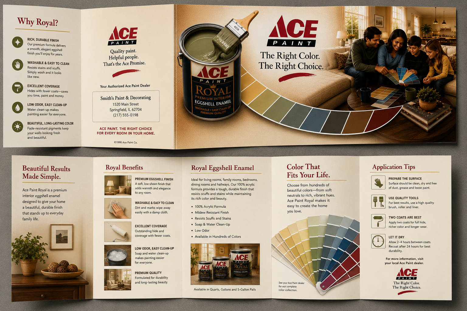
The idea was simple, but powerful. Rather than treating the side of a truck as a place to repeat a logo, the vehicle could carry a complete retail message. It could show the product, communicate the benefit, present a warm home environment, and reinforce Ace Paint as a confident color choice.
This page documents the design thinking behind that approach, while also showing a broader campaign ecosystem that could surround the fleet work: brochures, color cards, dealer displays, consultation scenes, and in-store graphics.
The Challenge
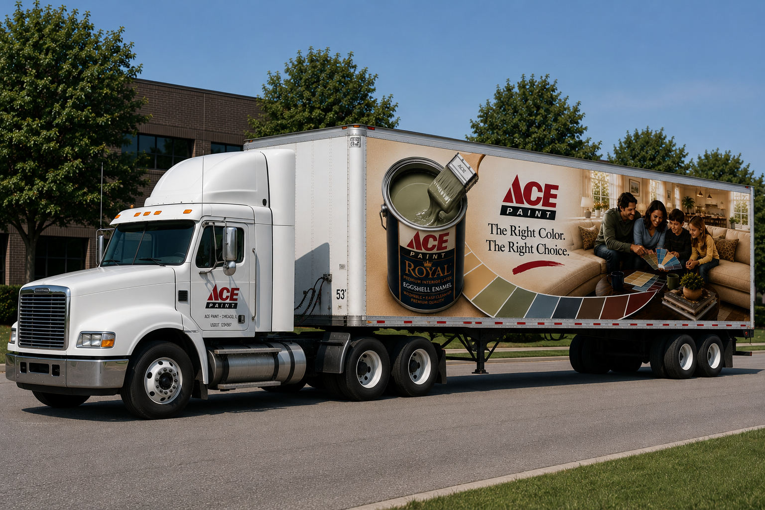
Fleet graphics have to work quickly. A viewer may only have a few seconds to understand the message while a truck is moving, parked, or partially blocked by traffic.
That meant the composition needed to be legible at scale, simple enough to read at a glance, and rich enough to make the product feel premium. The layout also needed to respect real vehicle constraints: seams, doors, handles, wheel wells, trailer edges, and viewing angles.
The design problem was not merely how to decorate a truck. It was how to turn a working vehicle into a clear, mobile advertisement without losing the warmth of a home-focused retail paint message.
My Role
My original role centered on the fleet graphics: developing the visual concept and adapting the message across truck surfaces so the work could function as high-impact outdoor advertising.
- Translate the Ace Paint Royal product story into a large-format vehicle graphic.
- Balance product prominence, brand recognition, color storytelling, and home-improvement emotion.
- Structure the composition so the message remained readable from distance and in motion.
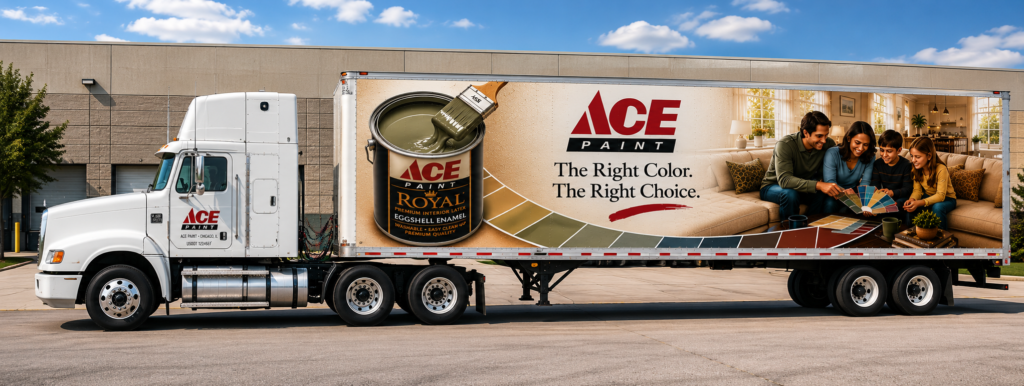
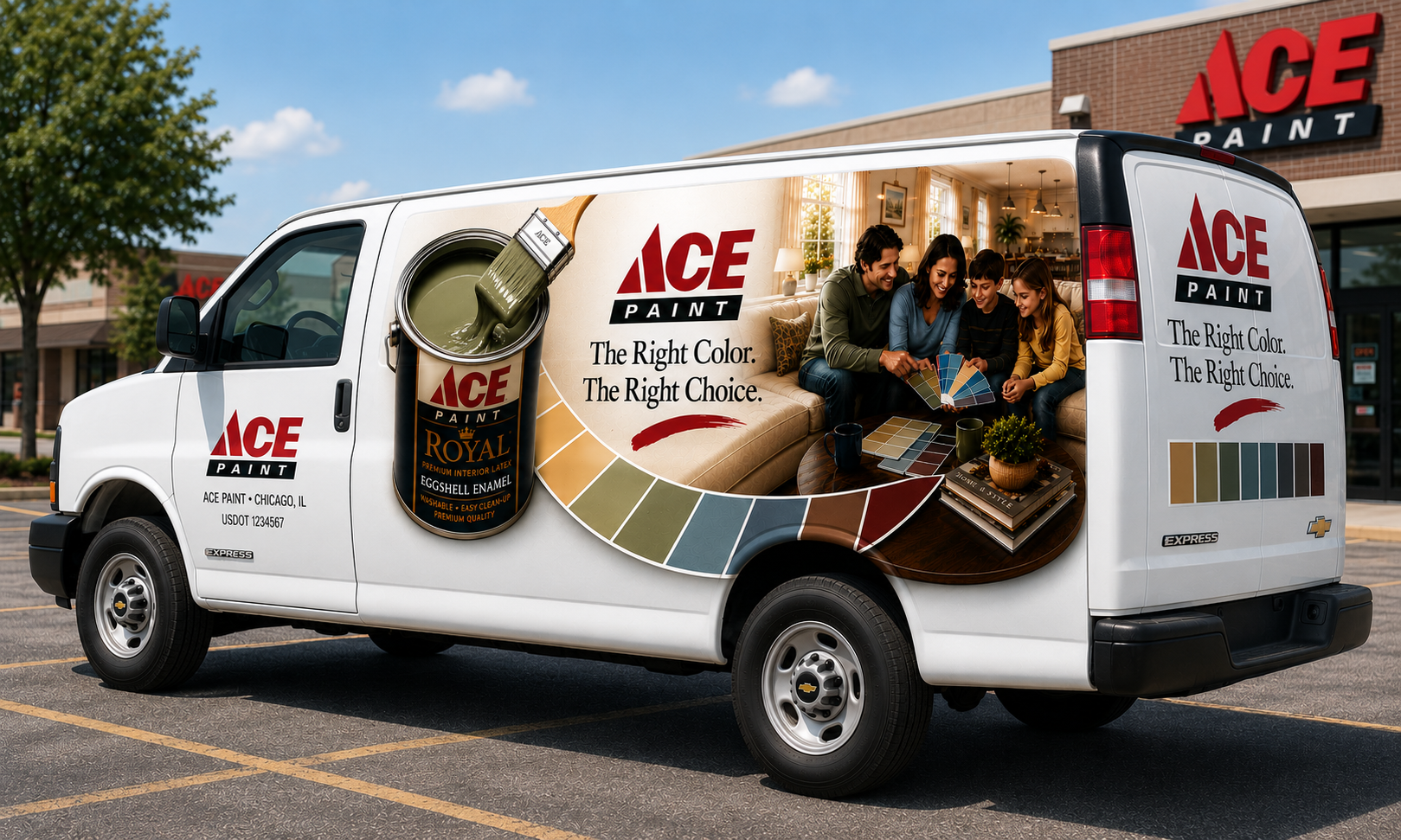
- Consider how the design would scale across delivery trucks, box trucks, vans, and larger trailer formats.
- Develop a visual language that could plausibly support dealer materials and in-store campaign touchpoints.
Design Approach
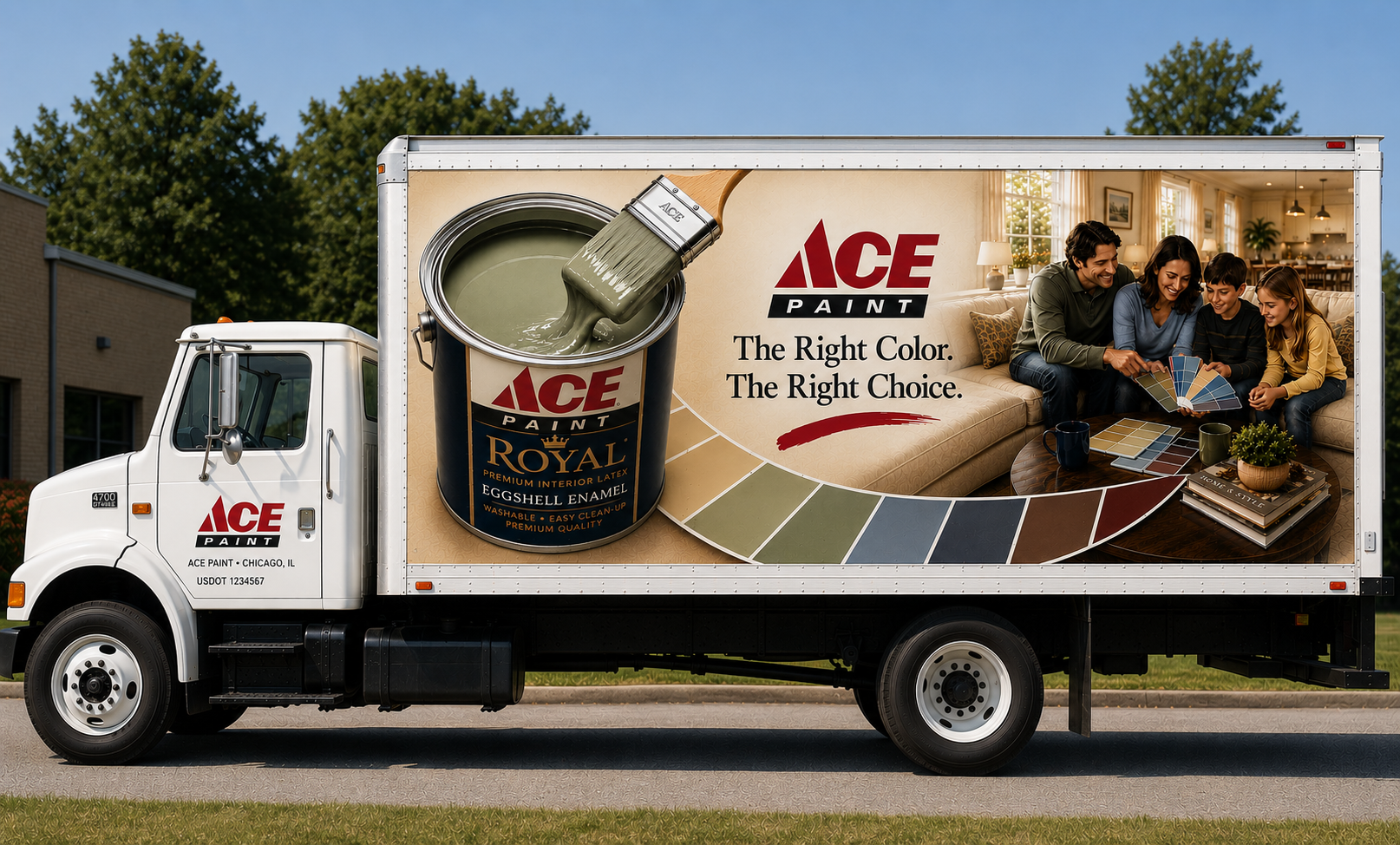
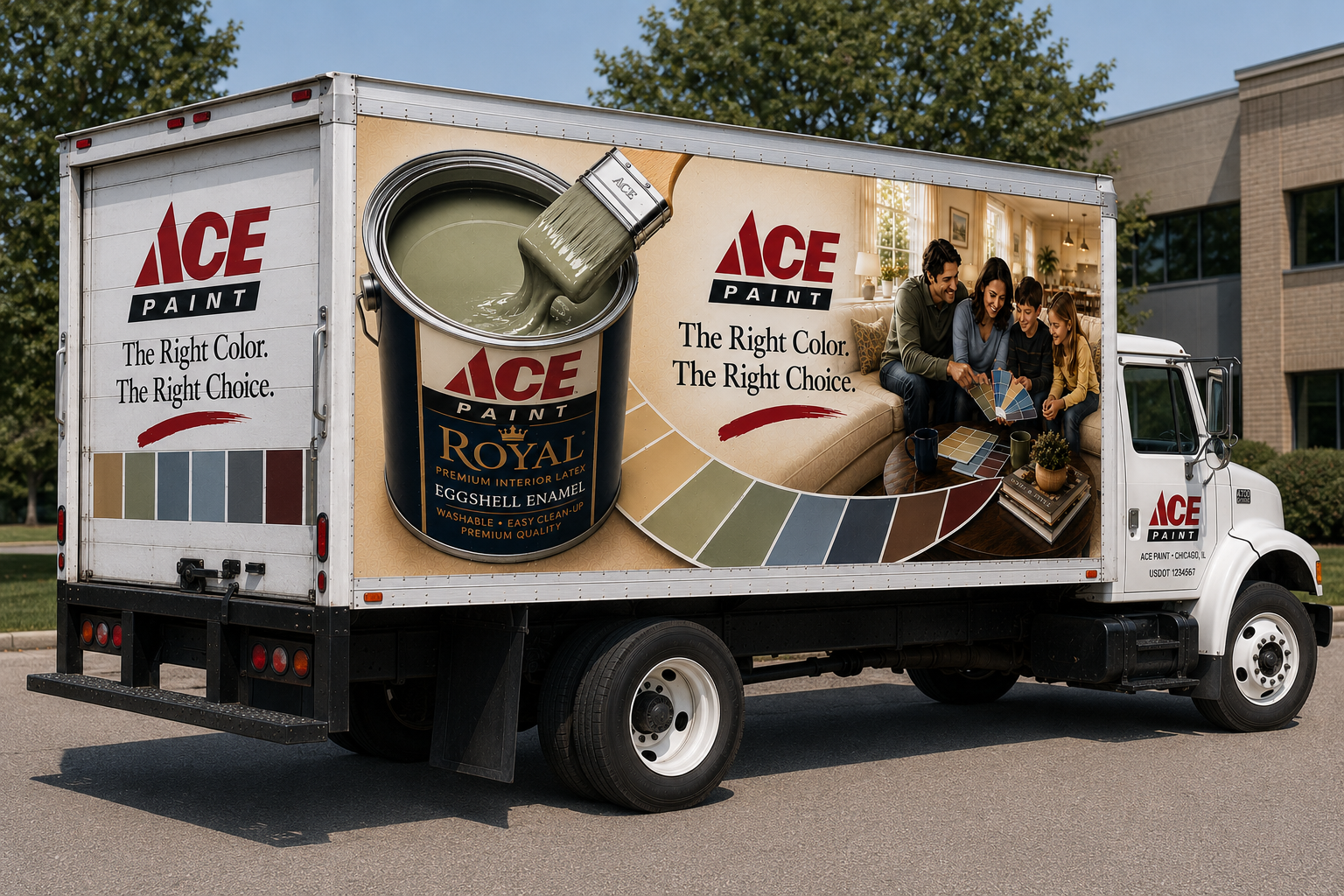
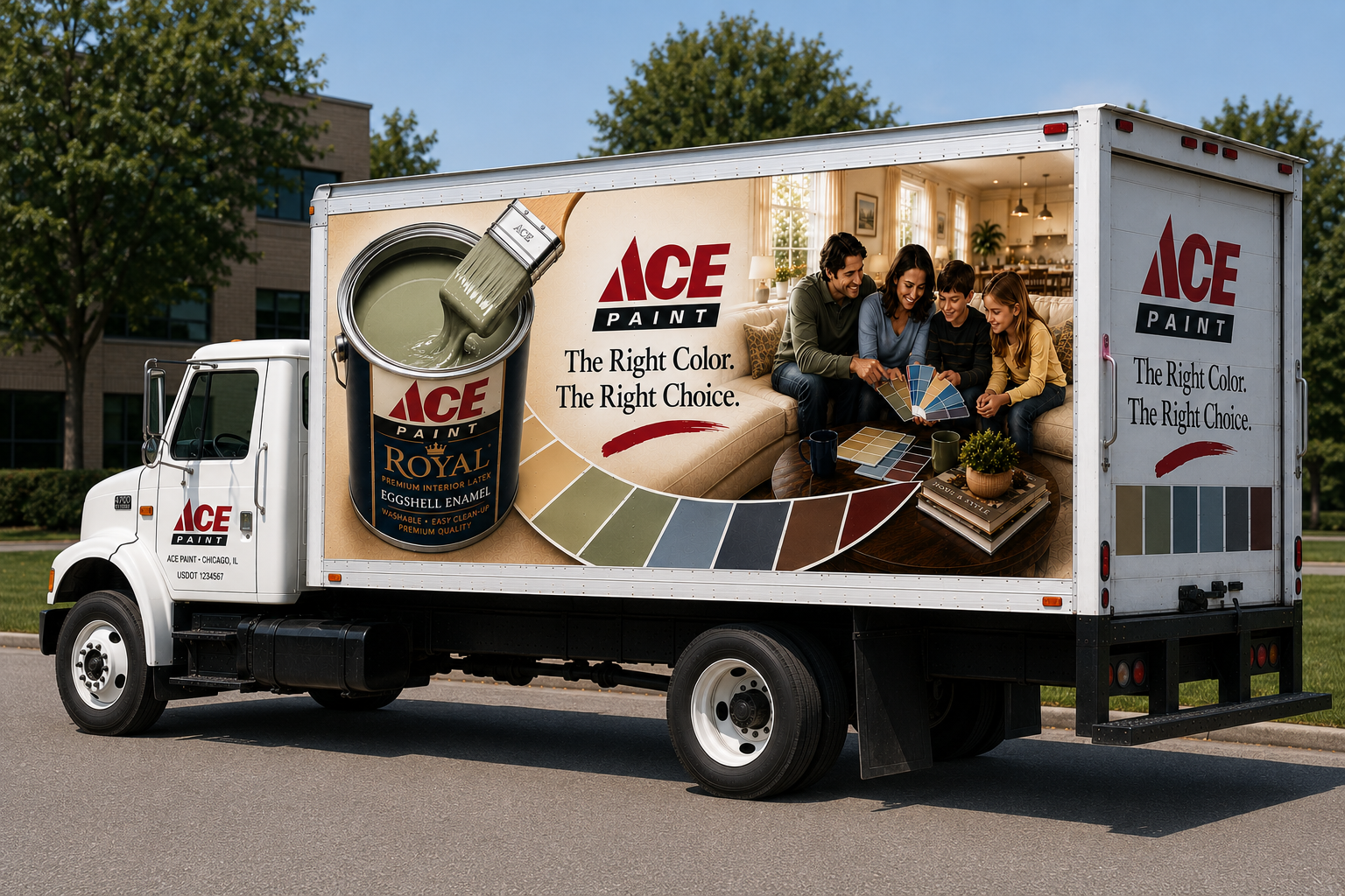
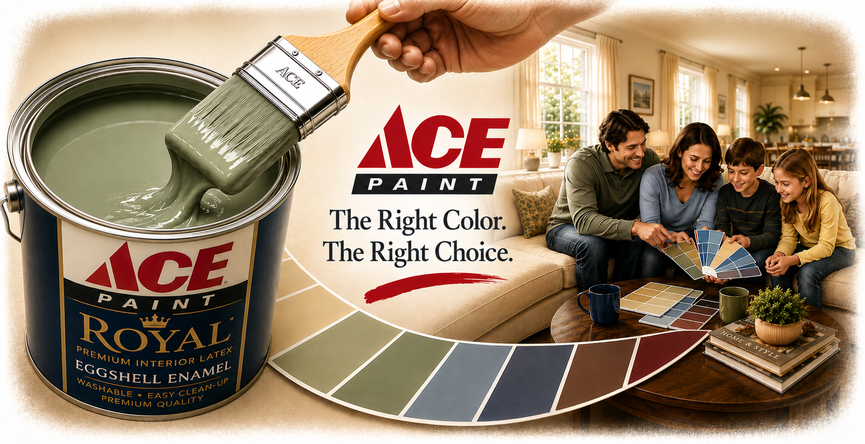
The creative direction leaned into a classic retail-paint formula: product, color, room, and promise. The paint can provides product recognition. The brush and sage green paint establish tactility. The color fan introduces choice. The family room scene makes the benefit feel personal. The line “The Right Color. The Right Choice.” keeps the message direct.
The vehicle format required discipline. The strongest elements needed to be large, separated, and readable from a distance. The color arc became a useful organizing device because it could connect the product image to the room scene while also suggesting selection, movement, and range.
The result is intentionally campaign-like. It feels larger than a single truck graphic because the core idea could stretch naturally into brochures, cards, displays, counter materials, and dealer environments.
Why “Moving Bulletin Boards” Worked
Large-scale fleet graphics created repeated public exposure without requiring a separate media placement.
The message paired product proof with emotional context: paint in the can, color in the home, and confidence in the purchase.
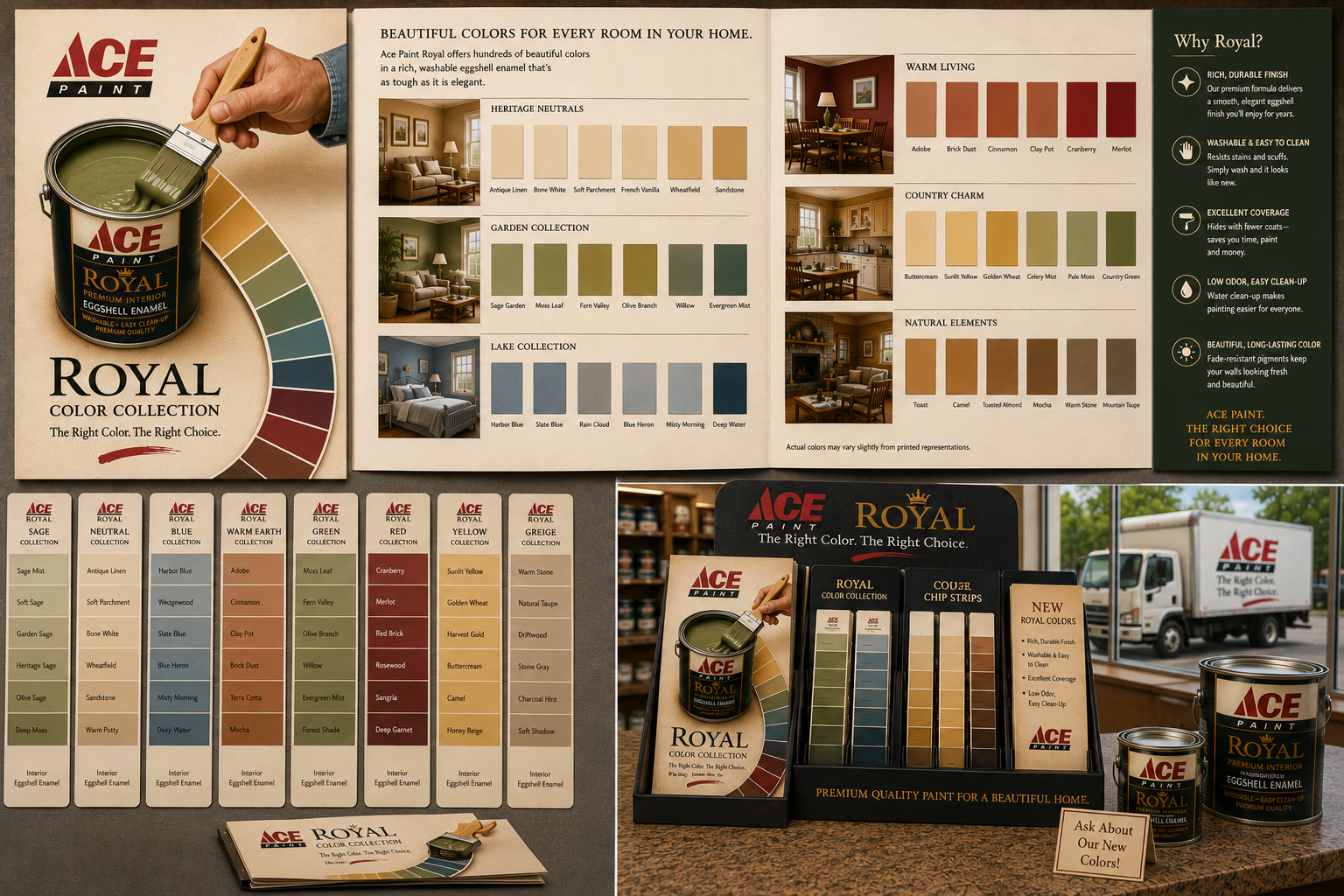
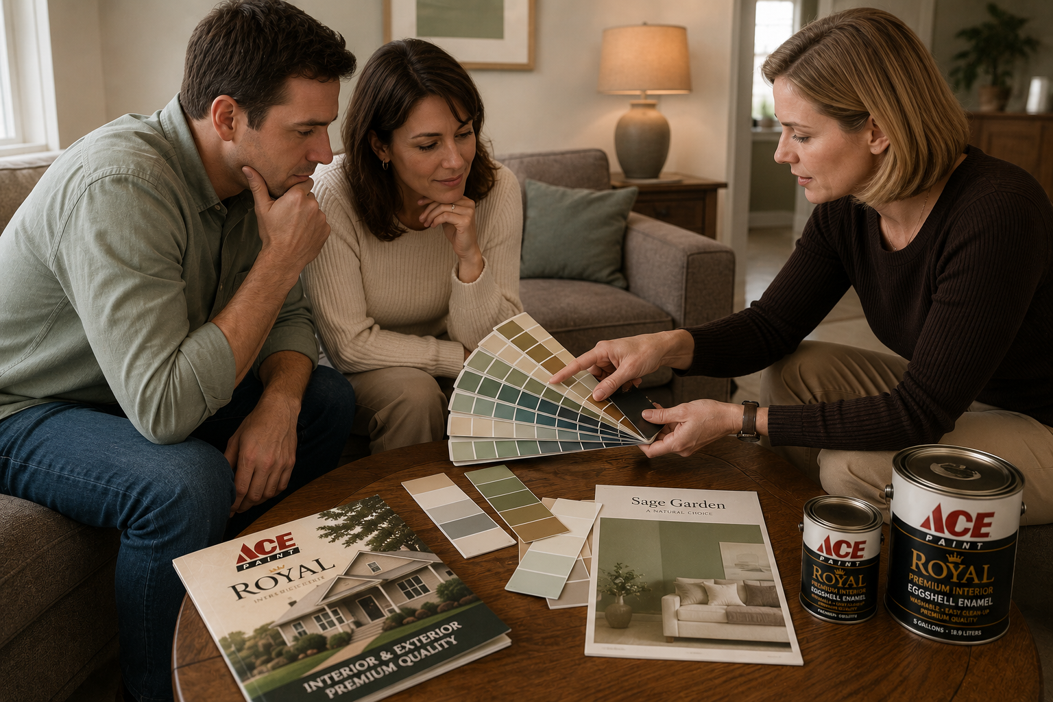
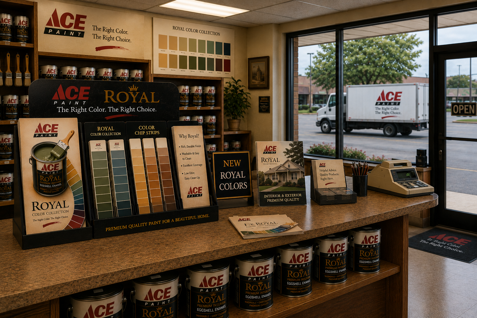
The same visual system could support dealer materials, point-of-sale displays, color cards, and sales conversations.
Fleet as Media
The vehicle graphics were designed to behave like mobile outdoor advertising: bold product recognition, a concise promise, and a warm home setting that gave the product a reason to matter.
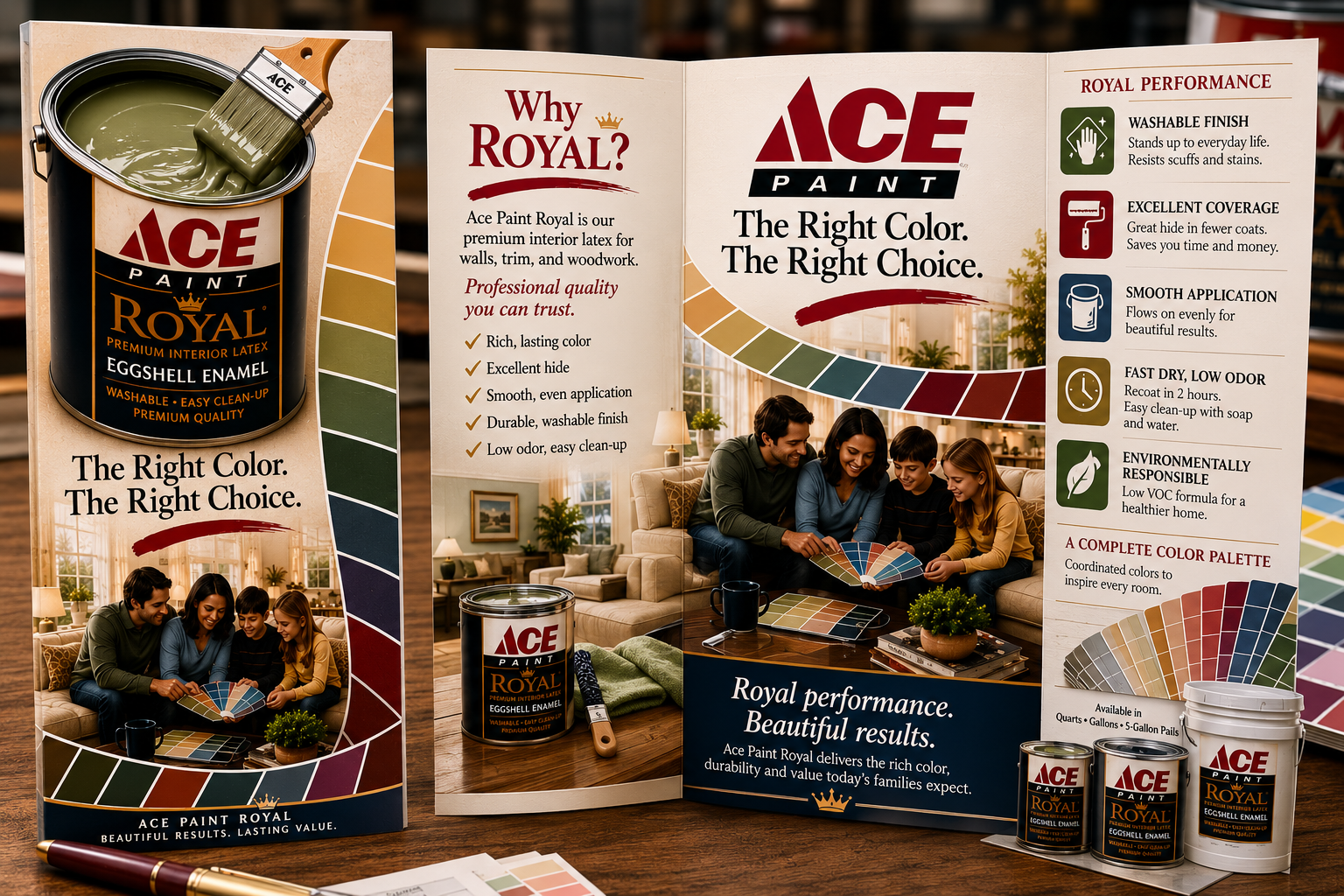
Extending the Story Beyond the Truck
The fleet concept becomes stronger when it connects to the same story customers see inside a store or during a sales conversation. The supporting visuals below show how the Ace Paint Royal message could extend from the road into the dealer environment.
The campaign ingredients stay consistent: premium product presentation, confident color selection, approachable room imagery, and benefit-driven language. Each touchpoint reinforces the same promise from a slightly different angle.
Campaign Ecosystem
Supporting concept visuals show how the vehicle message could be reinforced through brochures, color cards, dealer counters, consultation materials, and retail displays.
Outcome
The work positioned the Ace Paint fleet as more than a delivery function. It gave the vehicles a communication role: carry the brand promise into neighborhoods, past job sites, through dealer areas, and across everyday routes.
The strongest part of the idea is its efficiency. The same core visual system can advertise from the road, support a brochure, frame a color display, and help customers understand the product in context.
Reflection
Looking back, the most valuable design decision was treating the truck as a complete storytelling surface rather than a logo placement exercise.
The layout needed to be clear enough for motion, but warm enough for a home-improvement brand. That balance still feels right: direct, practical, visual, and customer-centered.
Good fleet graphics do not just identify who owns the vehicle. They make the vehicle work harder for the brand.
Interested in working together?
Whether you’re shaping a campaign, designing practical retail materials, or turning everyday brand touchpoints into stronger communication, I’d love to hear about it.
Get in Touch