
Brand Identity Project Showcase
Sterling Company Identity
Industrial heritage meets modern heavy-duty performance in a brand identity concept for hydraulic snow removal equipment.
Project Tags
Project Overview
The Sterling Company identity was developed as a concept brand system for a manufacturer of hydraulic snow removal equipment with imagined roots reaching back to the Industrial Revolution. Rather than leaning into a purely contemporary industrial aesthetic, the identity embraces legacy, durability, and American manufacturing heritage.
The custom script wordmark recalls the confidence of early industrial signage, locomotive badging, and hand-lettered equipment marks while remaining clean enough for contemporary use. The result is a brand that feels inherited rather than invented.
The goal was to create a visual identity that could plausibly span generations: a mark equally comfortable on an antique cast-iron nameplate, a modern municipal snowplow, corporate stationery, or a trade show booth.
Historical Context
The Sterling identity draws from a period when American industrial manufacturers built reputations through durability, visible craftsmanship, and equipment that had to perform under demanding conditions. The visual language references early railroad builders, foundries, machine shops, and heavy equipment companies without becoming a period piece.
That historical influence gives the system its character. The script wordmark suggests a company with roots, pride, and continuity, while the supporting applications show how that heritage could extend naturally into modern manufacturing, snow removal equipment, field operations, and customer-facing communications.
The Mark
Select the image to open the larger swipeable gallery.
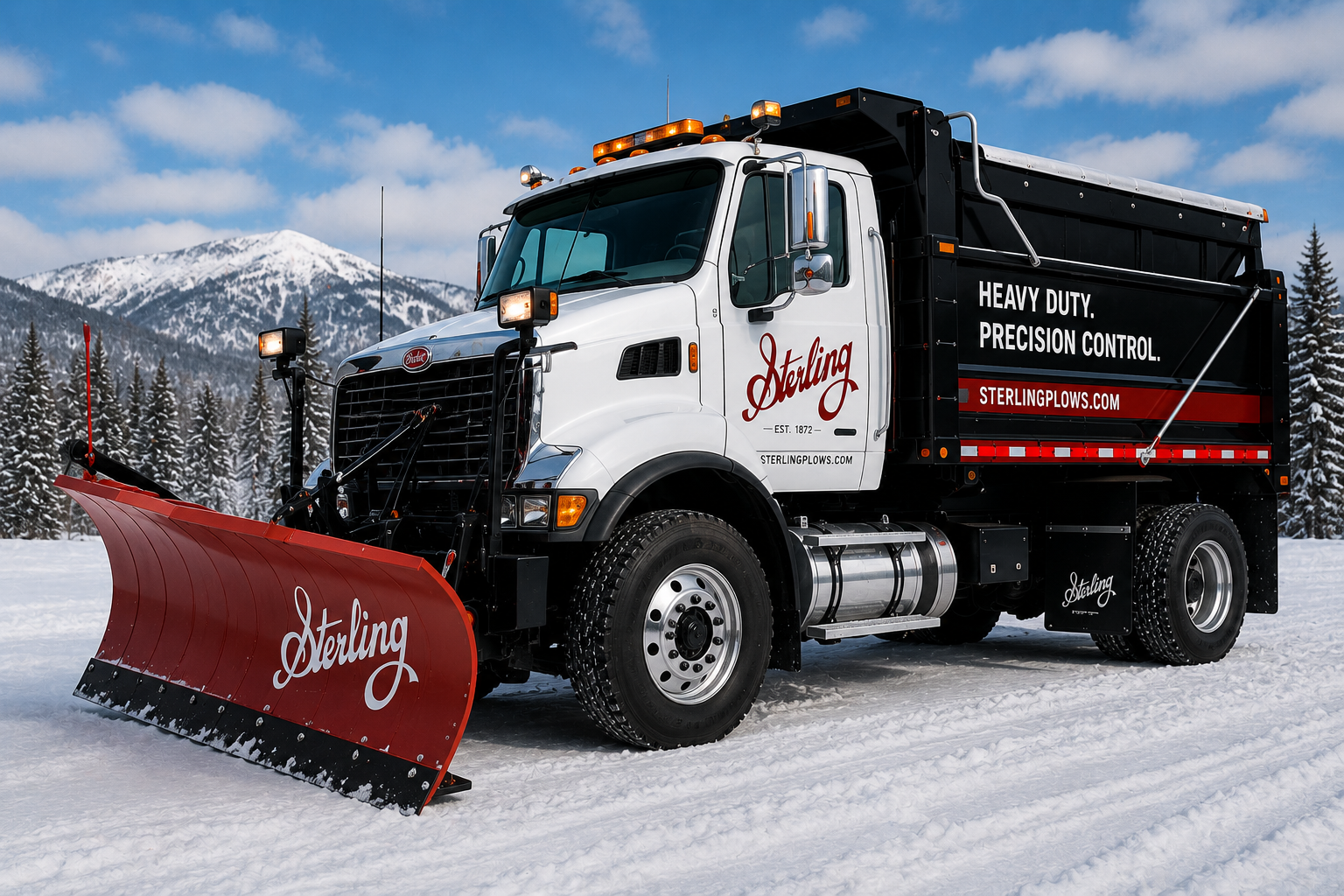
The Sterling wordmark was designed to balance nostalgia with strength. Its sweeping letterforms suggest craftsmanship and motion, while the deep red palette reinforces visibility, confidence, and the rugged nature of the equipment itself.
The goal was not to create a logo that simply looked old, but one that could plausibly belong to a company that had evolved over generations from steam-era engineering to modern hydraulic snow removal systems.
Brand in Context
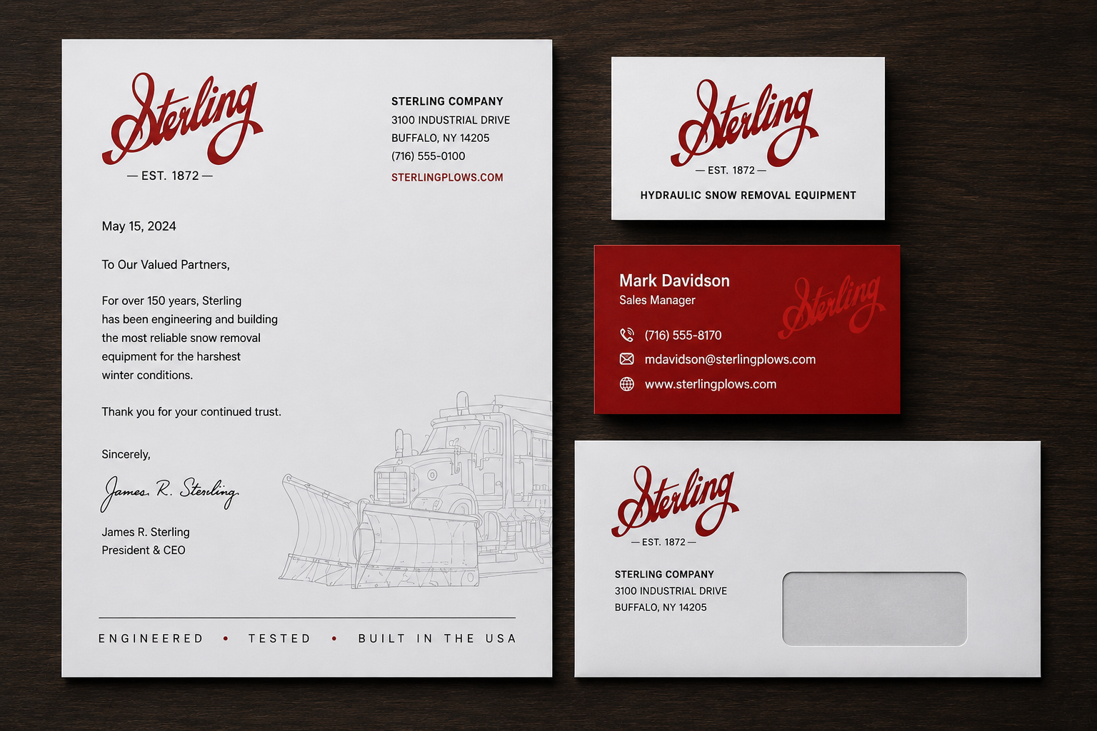
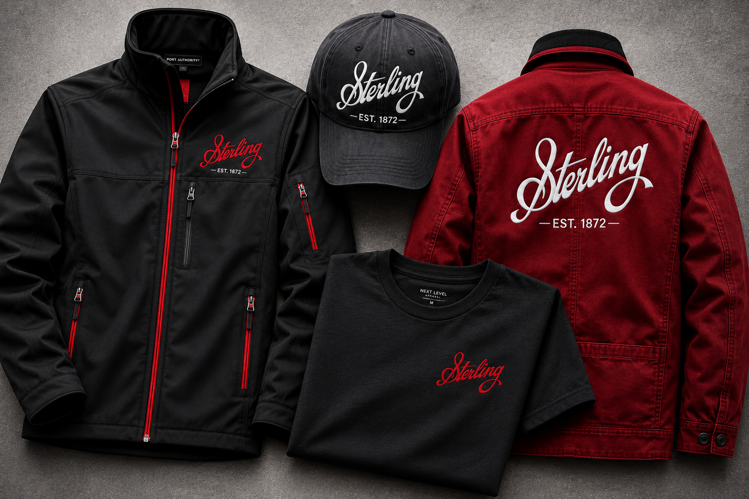
A successful industrial identity needs to perform across a wide range of environments, from small-format stationery to oversized fleet graphics and equipment branding. The Sterling system was extended across business materials, vehicle applications, apparel, signage, trade show displays, advertising, and product-category graphics.
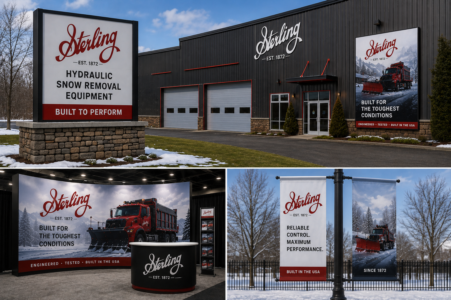
Selected Applications
Individual identity applications demonstrate how the Sterling system could extend across fleet graphics, business collateral, environmental graphics, apparel, and branded merchandise. Select any image to open the larger gallery, then use the arrows, keyboard, swipe gestures, or close control.
Design Strategy
The visual system was built around the idea of endurance. The script mark provides warmth and heritage, while the supporting typography, photography, color palette, and industrial applications give the identity a practical, heavy-duty presence.
Several principles guided the direction: high recognition at large and small sizes, enough personality to feel ownable, enough restraint to support professional use, and a visual tone that could bridge historic craftsmanship with modern manufacturing capability.
This balance allows the Sterling identity to feel appropriate across customer-facing collateral, field equipment, trade show environments, and brand applications where visibility, durability, and trust matter most.
Project Highlights
- Developed a heritage-inspired custom wordmark
- Balanced historic character with modern industrial usability
- Created a flexible identity system for fleet, signage, apparel, and collateral
- Extended the brand across realistic customer and field applications
- Reinforced perceptions of durability, reliability, and manufacturing expertise
Reflection
Sterling was conceived as a brand with history: established, trusted, and built for demanding conditions. By grounding the identity in traditional lettering and extending it through modern applications, the system creates a visual bridge between the company’s imagined industrial roots and its present-day manufacturing capabilities.
Looking back, this project reinforced my belief that some identities are strongest when they feel inherited rather than invented. The goal was not to decorate a modern company with nostalgic details, but to create a mark and system that could plausibly belong to an organization shaped by generations of manufacturing experience.
Good identity design does not simply identify an organization. It communicates character. In this case, the mark needed to suggest strength, heritage, confidence, and reliability before a customer ever reads a line of copy.
A strong identity should feel like it has always belonged to the organization it represents.
Related Identity Projects
Continue Exploring
Additional identity systems exploring telecommunications, enterprise communications, industrial branding, and product-focused brand applications.