
Brand Identity Project Showcase
Stay Perfect Fibers Identity
An ingredient-brand identity for a Monsanto fiber technology supplied to Caron Yarns and Threads and featured across the Caron product family.
Project Tags
Project Overview
Stay Perfect Fibers was created as a technology-driven identity for a Monsanto fiber innovation supplied to Caron Yarns and Threads. Rather than functioning as a stand-alone consumer yarn brand, Stay Perfect was designed as an ingredient brand: a quality signal that could appear across multiple name-brand labels within the Caron product family.
The identity needed to suggest performance, consistency, softness, and long-lasting product value while remaining flexible enough to live beside existing Caron packaging systems. It had to feel premium without overpowering the parent product line.
The final mark combines disciplined typography with an abstract fiber-inspired symbol. The olive-gold palette adds a refined technology cue, while the flowing emblem suggests flexibility, continuity, and textile movement.
Brand Context
Ingredient branding has a different job than traditional consumer branding. It does not need to own the entire shelf presence. Instead, it must quickly communicate added value inside an existing product ecosystem. The mark has to support the retail brand while giving consumers a reason to notice, trust, and remember the underlying technology.
Stay Perfect Fibers was intended to work this way: as a recognizable performance signature across Caron yarn and thread labels. The identity needed to be visible at small sizes, adaptable across many package formats, and credible enough to imply a technical advantage without feeling cold or industrial.
The Mark
Select the image to open the larger swipeable gallery.
The mark uses bold typographic structure paired with an expressive abstract symbol. The letterspacing in “Fibers” introduces a technical, measured quality, while the large flowing emblem adds softness and movement.
This contrast was important. The identity needed to feel engineered, but still appropriate for yarns, threads, craft materials, and soft consumer products.
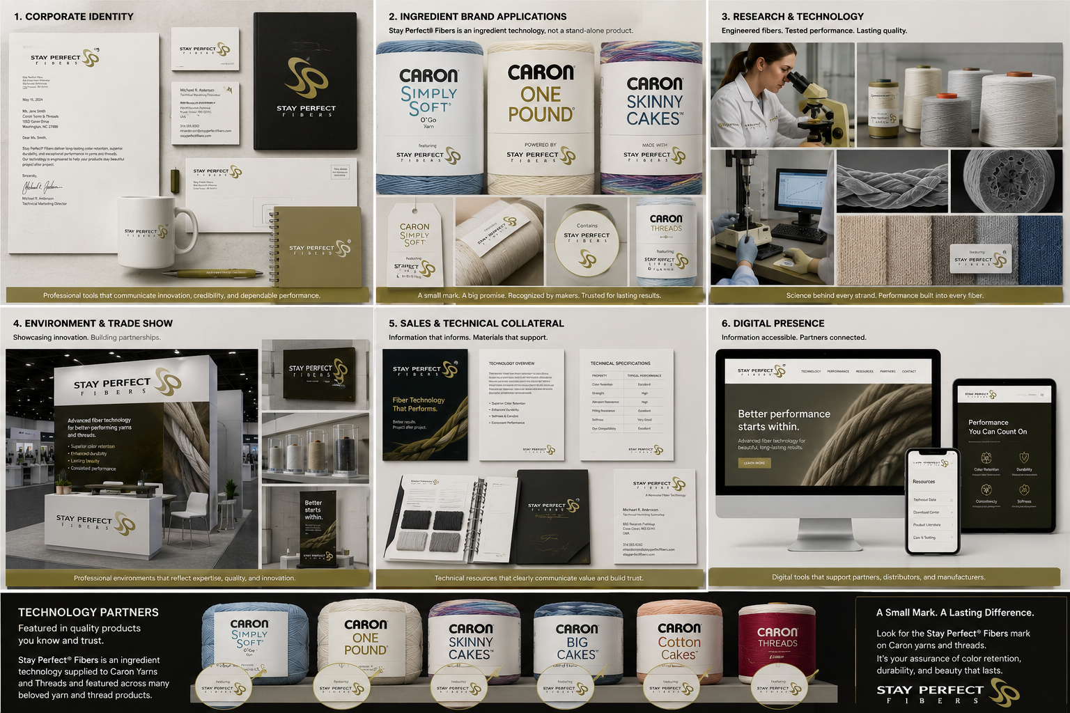
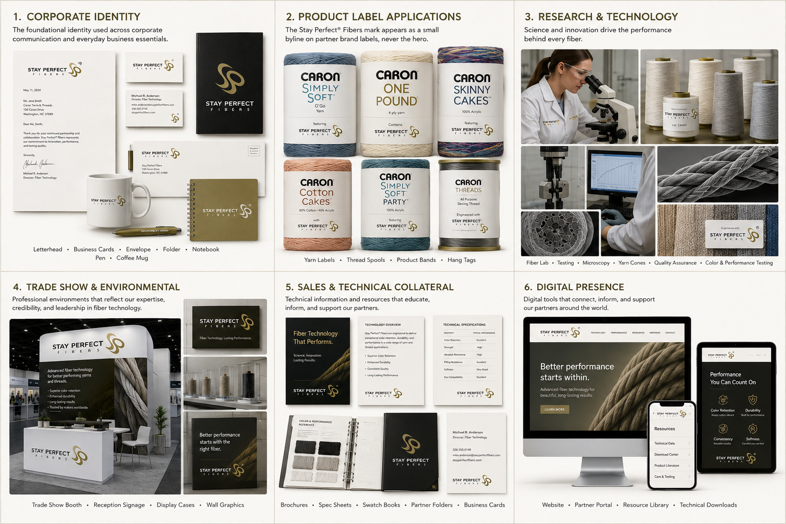
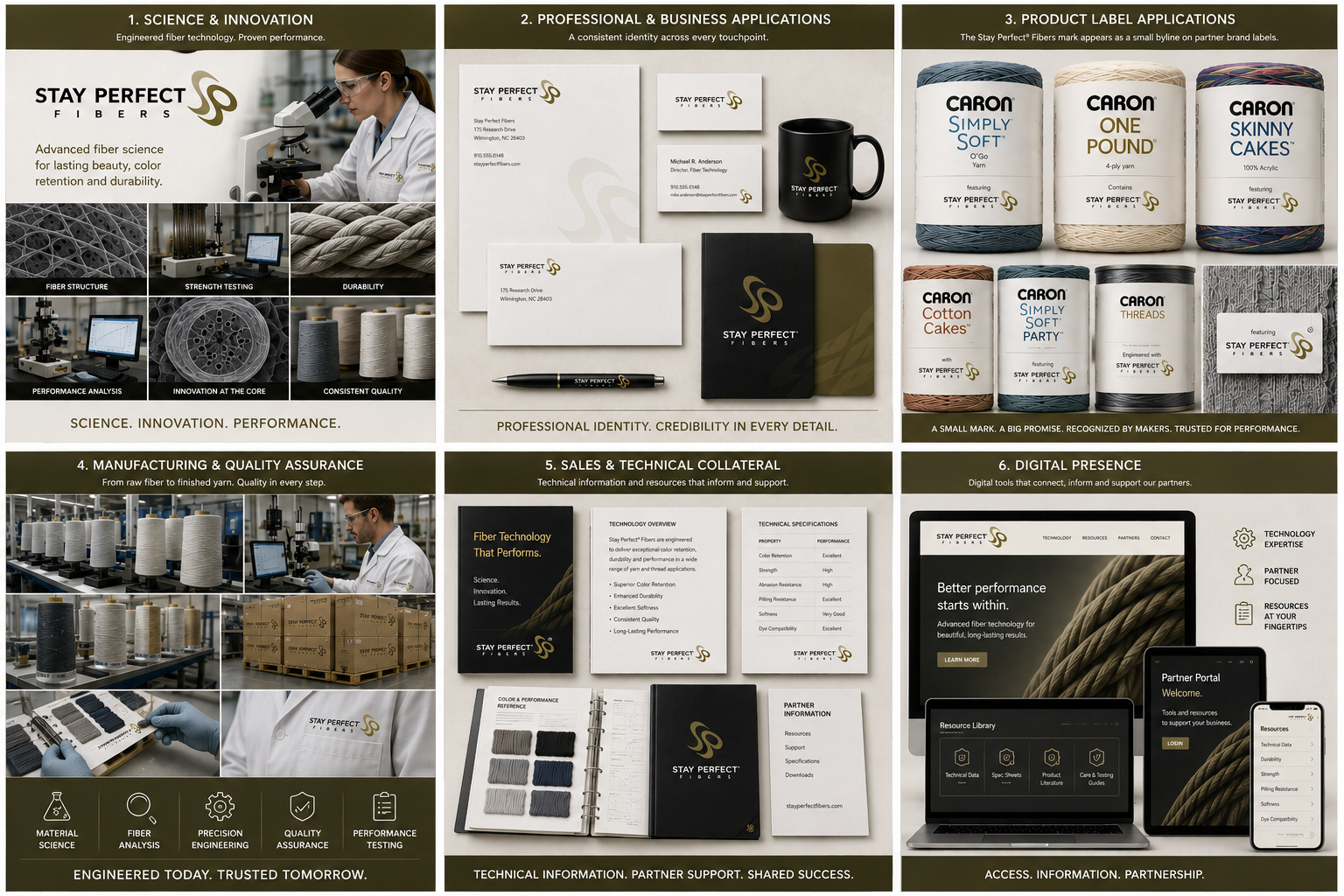
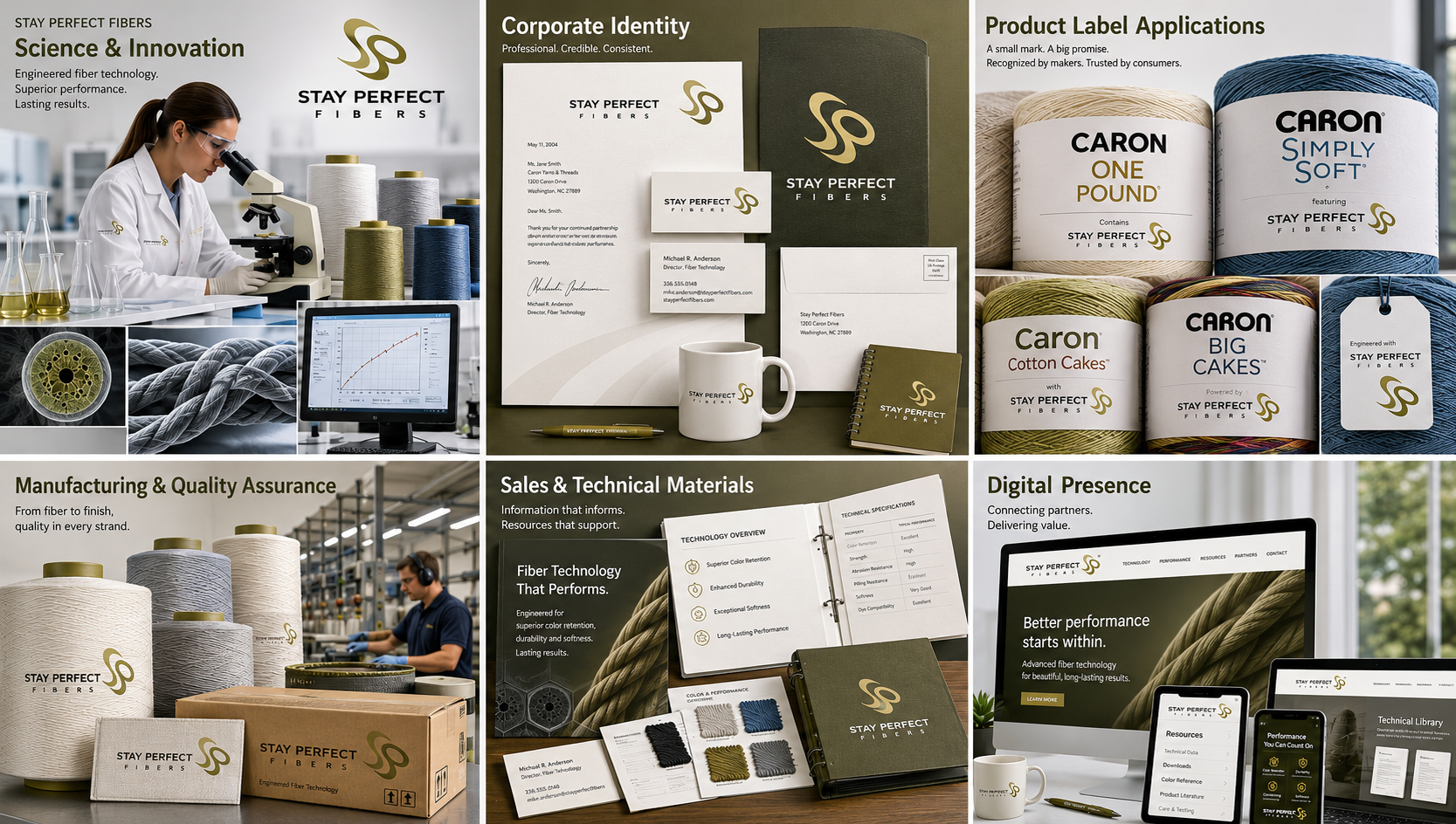
Selected Applications
Individual applications demonstrate how the identity could support Caron product labels, packaging systems, collateral, manufacturing environments, and promotional materials. Select any image to open the larger gallery.
Design Strategy
The strategy was to make Stay Perfect feel like a credible technology benefit without making it feel detached from the warmth of yarn and thread products. The identity needed to carry a technical promise while still belonging in a tactile, consumer-facing craft environment.
The symbol’s flowing form suggests fiber movement, loops, softness, and continuity. The typography adds confidence and structure, helping the mark function as a quality seal on packaging and a refined identity in sales or partner-facing materials.
The restrained color palette supports that balance. Olive-gold tones suggest premium value and subtle technology, while black and white applications allow the mark to reproduce clearly on labels, cartons, swatches, and package systems.
Project Highlights
- Designed an ingredient-brand identity for a Monsanto fiber technology
- Created a mark intended to support the Caron yarn and thread product family
- Balanced technical credibility with soft-goods warmth
- Developed a flexible visual system suitable for packaging, labels, and collateral
- Positioned the identity as a recognizable quality cue across multiple products
Reflection
Stay Perfect is a reminder that not every identity needs to be the hero brand. Sometimes the most important role is to support another brand by adding trust, clarity, and perceived value at the exact moment a customer is making a decision.
Ingredient brands need discipline. They must be recognizable, but not overpowering. They must communicate benefit quickly, but not compete with the product they support. This project required a careful balance between visibility, restraint, and meaning.
The finished identity gives the technology a clear visual signature while allowing the Caron product family to remain the primary retail voice.
A strong ingredient brand adds value without stealing the spotlight.
Related Identity Projects
Continue Exploring
Additional identity systems exploring product programs, manufacturing brands, service brands, and technology-driven visual systems.