
Packaging Design Case Study
Rust-Oleum Packaging & Brand Support
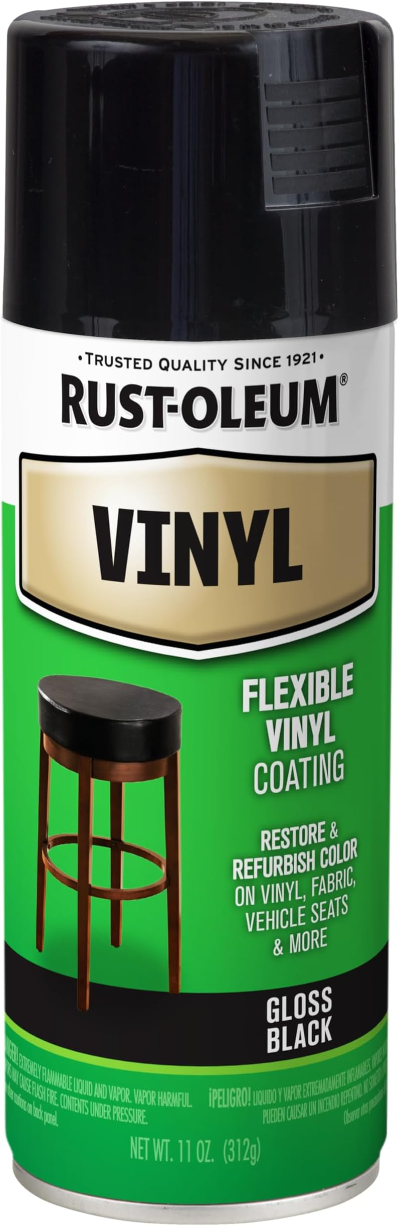
Supporting nationally distributed packaging and brand systems through trilingual label updates, typography, production coordination, and retail-ready design across multiple Rust-Oleum product lines.
Project Highlights

Overview
My work with Rust-Oleum involved supporting the in-house marketing group across packaging, label design, POP design, brand support, and retail-ready production needs.
The work spanned multiple well-known product lines, including Stop Rust, Professional, Painter’s Touch, Stone Creations, Specialty, and American Accents.
These efforts supported a nationally recognized brand during a period of retail expansion and packaging change, including opportunities connected to major retail distribution.
Business Context
Rust-Oleum products needed to perform in crowded retail environments where packaging had to communicate quickly, carry required information, and remain recognizable across a large family of products.
The design work was not about creating isolated one-off labels. It was about supporting a larger packaging ecosystem where consistency, accuracy, production readiness, and shelf impact all mattered.
The Challenge
The year I joined Rust-Oleum, label requirements shifted from bilingual to trilingual, requiring English, Spanish, and French to appear on existing packaging.
That change created a demanding design challenge: fit significantly more required content into the same available space without increasing label size, weakening the brand, or sacrificing readability.
The opportunity was to maintain compliance and brand consistency while solving a difficult typography and production problem across dozens of SKUs and many package formats.
Packaging Scope
The work touched a wide range of packaging sizes, product lines, and production formats.
- Pint cans
- Half-pint cans
- Quart cans
- Gallon cans
- Consumer spray cans
- Professional spray cans
- Dozens of SKUs across multiple Rust-Oleum product lines
Each format introduced its own spatial constraints, hierarchy decisions, production considerations, and brand requirements.
My Role
As Designer, I supported packaging, branding, marketing, and production needs across multiple product lines.
- Designed and updated product labels
- Supported trilingual packaging requirements
- Maintained brand consistency across multiple product families
- Created POP and marketing support materials
- Prepared production-ready artwork
- Worked directly with printers and production vendors
- Supported revised packaging launches and retail readiness
Design Approach
The design approach relied heavily on hierarchy, spacing, disciplined typography, and practical production judgment.
The additional language requirements meant that every label needed to be reevaluated as a system. Product names, safety information, claims, usage details, supporting copy, and legal or regulatory content all had to coexist within limited physical space.
Rather than treating typography as a finishing detail, it became the main design tool for protecting readability and structure.
The Typography Challenge
The labels needed to include English, Spanish, and French while preserving readability, hierarchy, safety information, product identification, and brand recognition.
This required careful use of type size, type style, Helvetica Narrow, kerning, leading, spacing, and layout discipline. Every fraction of space mattered.
My training in typography at Iowa State University, along with earlier experience designing nutraceutical labels, prepared me for the demands of this work.
Brand Evolution
In addition to regulatory label updates, the work also involved helping support the ongoing evolution of Rust-Oleum’s visual language.
One memorable effort involved helping steer portions of the brand away from an older tartan plaid treatment toward a more modern checked, flatter pattern.
New branded product lines also created opportunities to explore typography, logotype treatments, and more contemporary visual applications for mainstream retail markets.
Production & Vendor Coordination
Packaging design at this scale required direct coordination with printers and production vendors.
The work needed to be accurate, printable, compliant, and consistent across formats. Small mistakes could have significant downstream consequences, especially when labels were tied to regulatory requirements and national retail distribution.
Working with vendors reinforced the importance of production knowledge, technical accuracy, and clear communication.
Outcome
The revised packaging achieved regulatory compliance, supported successful product and packaging updates, maintained brand consistency across product lines, and helped support Rust-Oleum’s broader retail readiness during an important period of business growth.
The work contributed to packaging systems that could function across multiple product lines, package sizes, and retail environments while preserving the integrity of the Rust-Oleum brand.
Reflection
Looking back, I am most proud of mastering typography under real-world constraints.
Packaging design often looks simple from the outside, but every label carries competing demands: compliance, readability, brand identity, shelf presence, production accuracy, and available physical space.
This experience helped bridge my career from smaller design environments into larger corporate design systems, and it reinforced a lesson I have carried ever since:
Strong design is not always about having more space. Sometimes it is about making better decisions within the space you have.
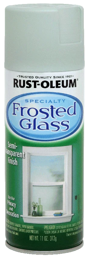
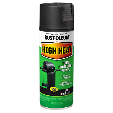
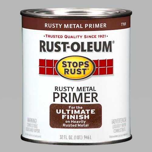
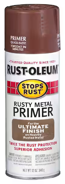
Supporting Visuals
A selection of packaging and labels from related Rust-Oleum brand projects.


Interested in working together?
Whether you’re developing packaging systems, refining brand standards, or solving complex production challenges, I’d love to hear about it.
Get in Touch