
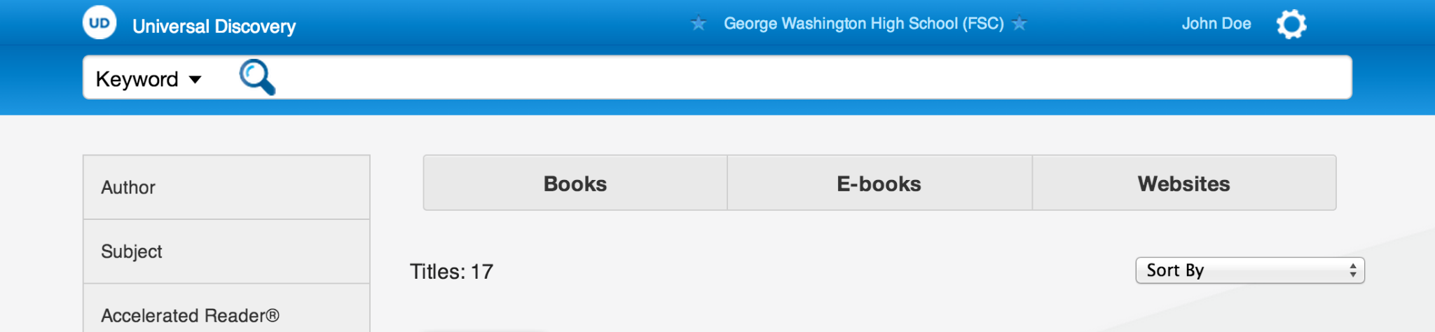
Primary Search
The search field was given visual priority so students and staff could begin with a familiar action before navigating deeper filters or content categories.
UX/UI Design Study
Designing a unified K-12 discovery experience that helped students, teachers, librarians, and administrators search across books, eBooks, websites, databases, and digital learning resources from one clear interface.
Methodology
Universal Search was not simply a search interface. It was a product simplification effort that required understanding fragmented content systems, organizing them into one clear experience, designing repeatable patterns, validating usability, and creating a foundation the platform could continue to build upon.
01 / Understand
The work began by understanding how students, teachers, librarians, and administrators searched across disconnected catalogs, eBooks, databases, websites, and digital learning resources before the interface attempted to unify them.
Follett Universal Search was designed to solve a common problem in school libraries: content lived in too many separate places. A student might need to search the library catalog, eBook collections, database subscriptions, curated websites, and digital learning tools separately before finding the right resource.
The project unified those discovery paths into a single product experience. Instead of asking users to understand the underlying content systems first, the interface allowed them to begin with a familiar search pattern, then refine, browse, evaluate, and act on results across multiple sources.
My work focused on front-end design, UX design, interaction patterns, visual hierarchy, interface consistency, and collaboration with product, engineering, architecture, sales, leadership, and external stakeholders.
The Problem
School library ecosystems had become increasingly fragmented. Physical books, eBooks, subscription databases, websites, reading tools, and classroom resources were valuable, but they often lived behind different interfaces, labels, and search behaviors.
Universal Search reframed that experience around the user. Rather than exposing the organizational complexity first, the product brought multiple sources together and presented them through a consistent discovery model.
One search model, one visual language, one path into many kinds of educational content.
The Search Experience
The interface supported the behaviors users expected from modern search: choosing a search type, receiving suggestions, recovering from spelling mistakes, and moving quickly from a broad query into useful results.
The search field was given visual priority so students and staff could begin with a familiar action before navigating deeper filters or content categories.

The dropdown made advanced search behavior available without forcing every user into a more complicated search form.
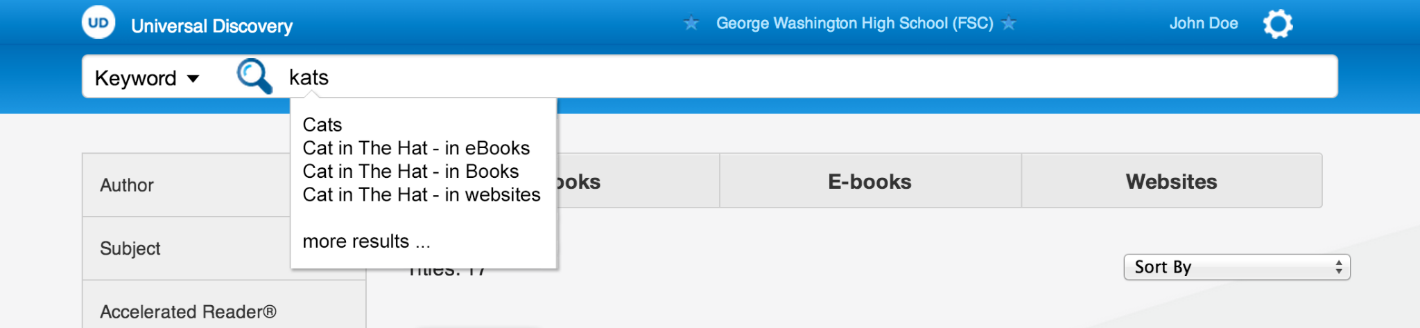
Suggestions reduced friction by helping students recover from uncertain spelling, incomplete titles, and exploratory search behavior.
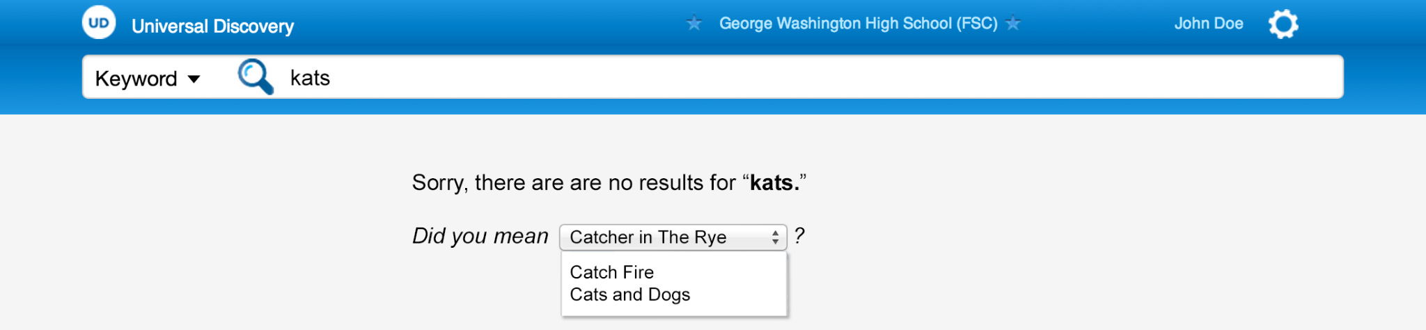
The no-results experience kept users moving by suggesting alternatives instead of treating a failed query as the end of the search journey.
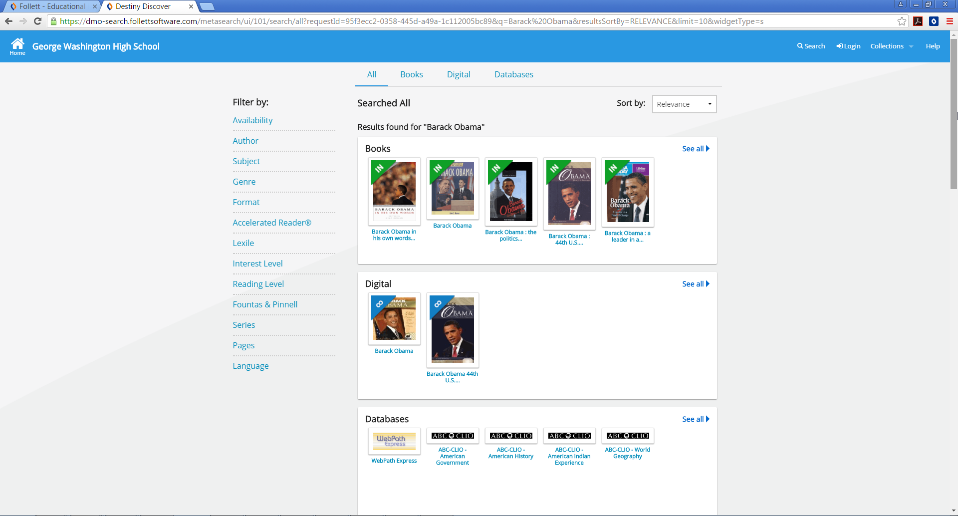
Federated Results
The core experience brought together results from books, digital resources, and databases. The challenge was not only technical integration, but also visual organization: users needed to understand what kind of result they were seeing, where it came from, and what they could do next.
The interface grouped content by media type while preserving a consistent search rhythm. Facets on the left supported refinement, while category tabs and result groups helped users scan across the full collection without losing context.
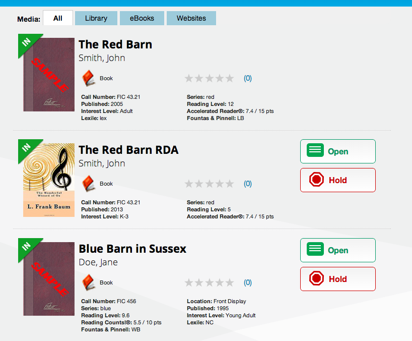
Result Cards
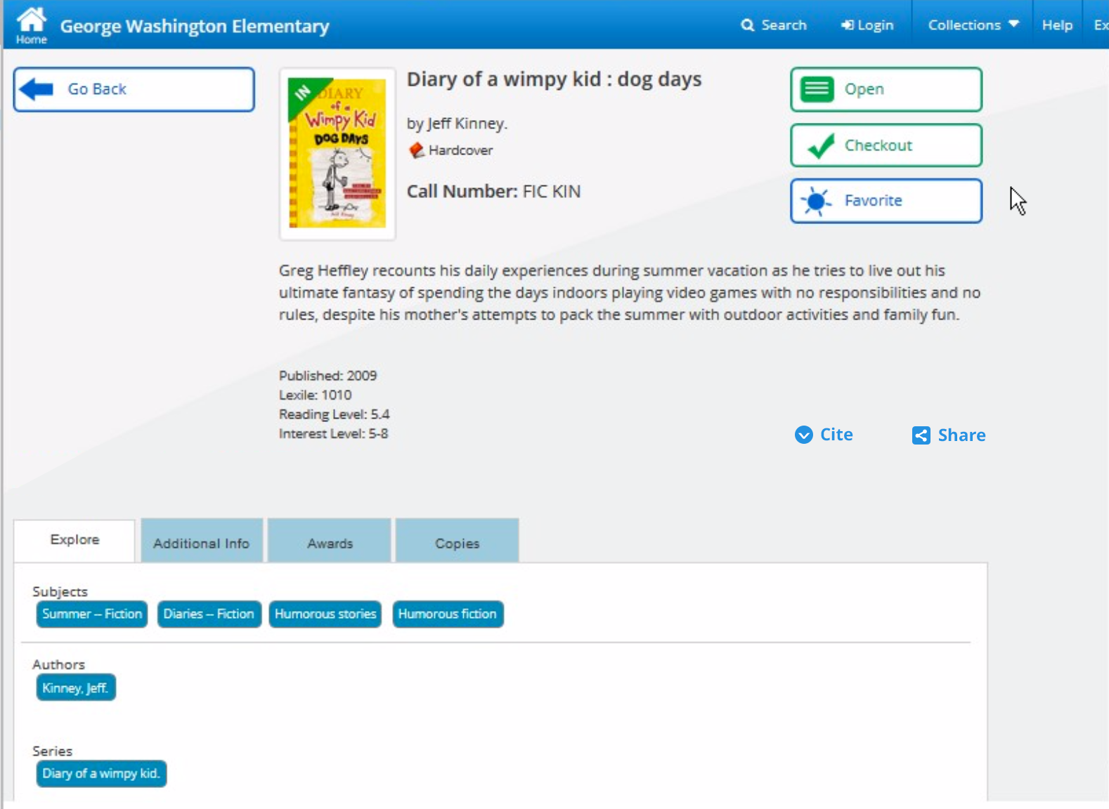
Result cards had to work across many content types without feeling inconsistent. Each result needed a recognizable title area, author information, source indicator, availability status, educational metadata, and clear action buttons.
The card pattern created a repeatable structure that could be reused across books, eBooks, digital resources, and database content while still allowing each content type to expose its most relevant attributes.
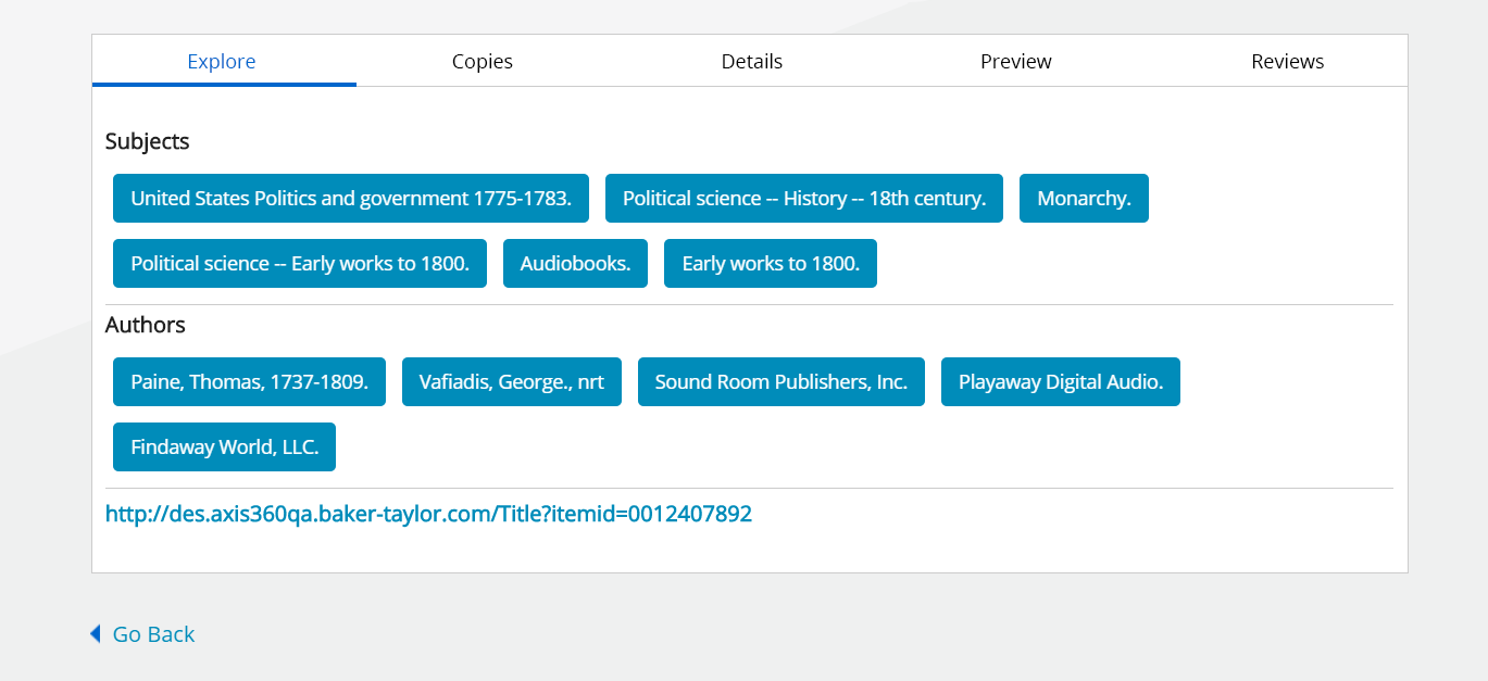
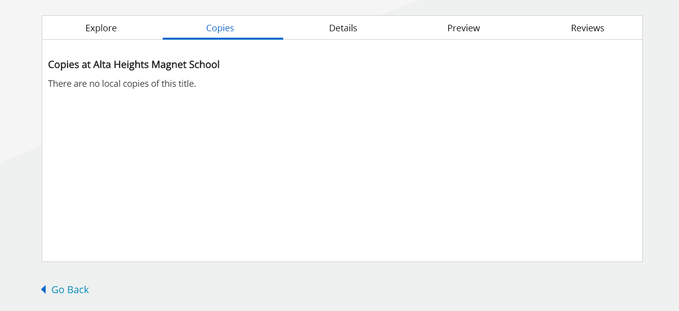
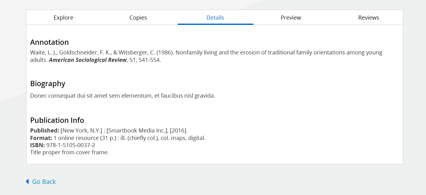
Item Detail Experience
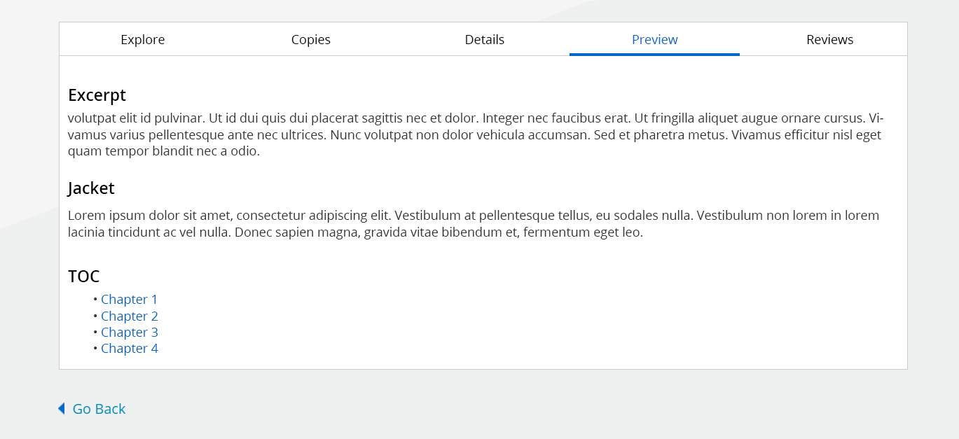
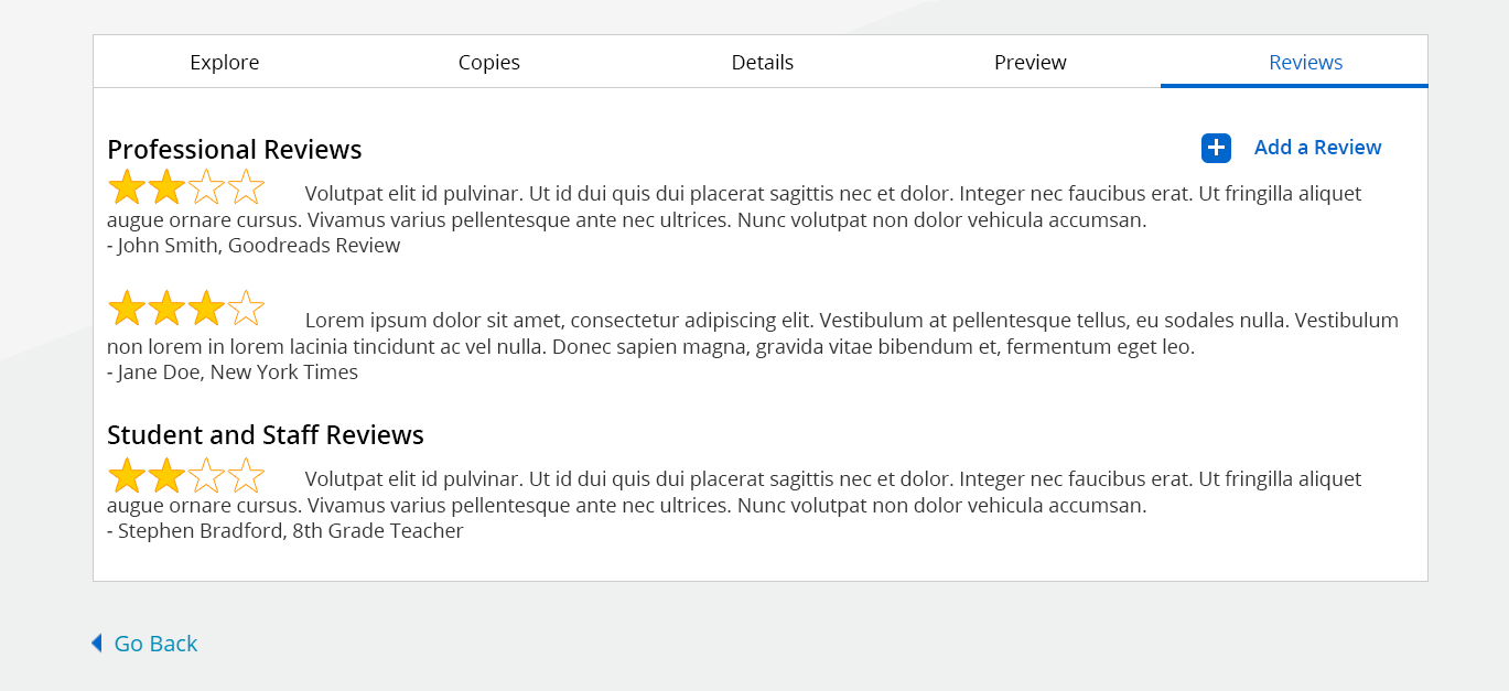
The detail experience organized deeper information into tabs so users could explore availability, subject metadata, publication details, excerpts, and reviews without overwhelming the primary page.

Beyond Search
As the platform matured, the experience expanded beyond finding resources. Reading Paths, Bookbag, checkouts, digital resource links, and personalized navigation helped position the product as a broader discovery and reading environment.
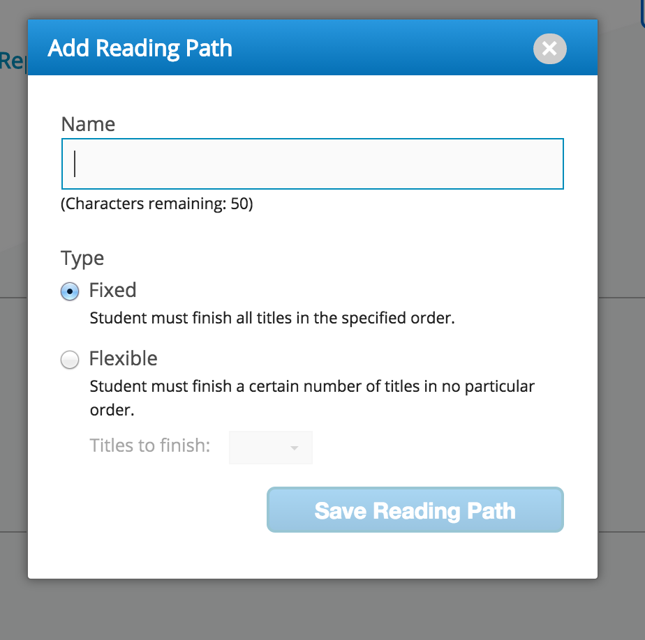
Reading Paths extended discovery into guided learning, allowing educators to structure how students moved through selected titles.
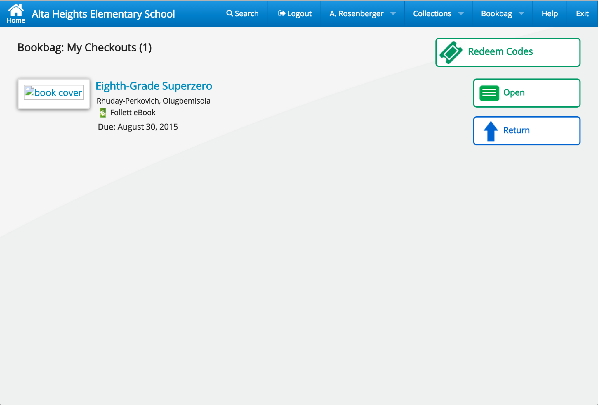
Bookbag introduced a personal workspace where users could manage checked-out items, open resources, return titles, and redeem access codes.
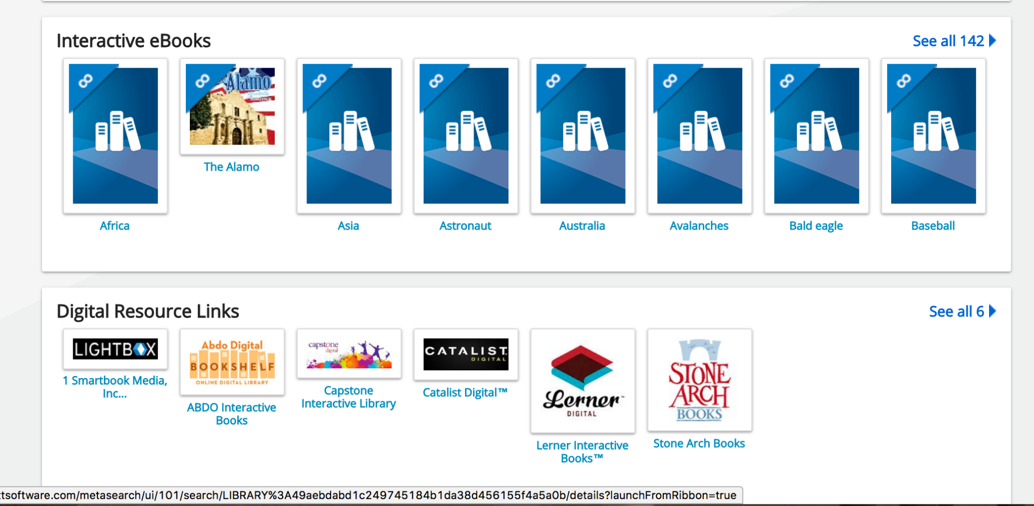
Card-based resource modules helped the experience accommodate browsable digital content alongside search-driven discovery.
As the product ecosystem expanded, navigation had to support account status, collections, bookbag activity, help, and institutional context.
Design Decisions
The most important work was not simply arranging screens. It was creating a system of patterns that could scale across content types, users, roles, workflows, and future product evolution.
Make the primary action obvious and immediate, especially for students who may not understand how content is organized behind the scenes.
Respect the differences between books, digital content, websites, and databases while presenting them within one unified search model.
Allow users to narrow results through meaningful educational metadata such as author, subject, format, interest level, and reading level.
Use a consistent result pattern so users could scan titles, authors, cover art, availability, ratings, and actions without relearning each content type.
Use tabs to keep deeper metadata, copies, previews, and reviews accessible without overwhelming the first view of the item detail page.
Prioritize high-value actions such as Open, Hold, Checkout, Favorite, Cite, Share, and Return where they supported the user journey.
Universal Search required alignment across a large, multi-disciplinary organization. The work involved product management, architecture, development teams, sales, leadership, executive stakeholders, external market consultants, and customers who cared deeply about how students and librarians discovered content.
The biggest challenge was not only deciding what the interface should look like. It was helping the organization agree on a single approach to layout, functionality, branding, search behavior, and long-term product direction. The design had to be simple enough for students, useful enough for librarians, credible enough for administrators, and technically feasible enough for engineering teams to build and maintain.
The work succeeded because the interface reduced visible complexity without hiding the depth of the educational content ecosystem behind it.
The product performed well in usability studies and received positive customer feedback. Leadership felt the experience stood apart in the K-12 education technology market because it gave schools a clearer, more modern path into their growing collections of physical and digital content.
Universal Search also established a foundation for the broader Destiny Discover experience, expanding from a search-centered application into a larger discovery, reading, and resource-management platform.
Looking back more than a decade later, Universal Search feels like an early design-system effort as much as a search project. The screens use consistent navigation, repeated card structures, reusable tab patterns, predictable actions, and disciplined metadata hierarchy across many product areas.
If I were approaching the project today, I would spend even more time on accessibility, responsive behavior, semantic search, personalization, recommendation models, and AI-assisted discovery. The underlying problem remains relevant: users still need help finding the right information across too many disconnected systems. The tools have changed, but the design challenge is very familiar.
Original design specifications, interaction documentation, and implementation guides created during product development.