
Identity & Illustration
Drake Newman Center Identity
A 1993 collegiate ministry identity designed to feel welcoming, stable, practical, and recognizable across student communications, campus signage, apparel, and weekly Sunday materials.
Project Tags
Project Overview
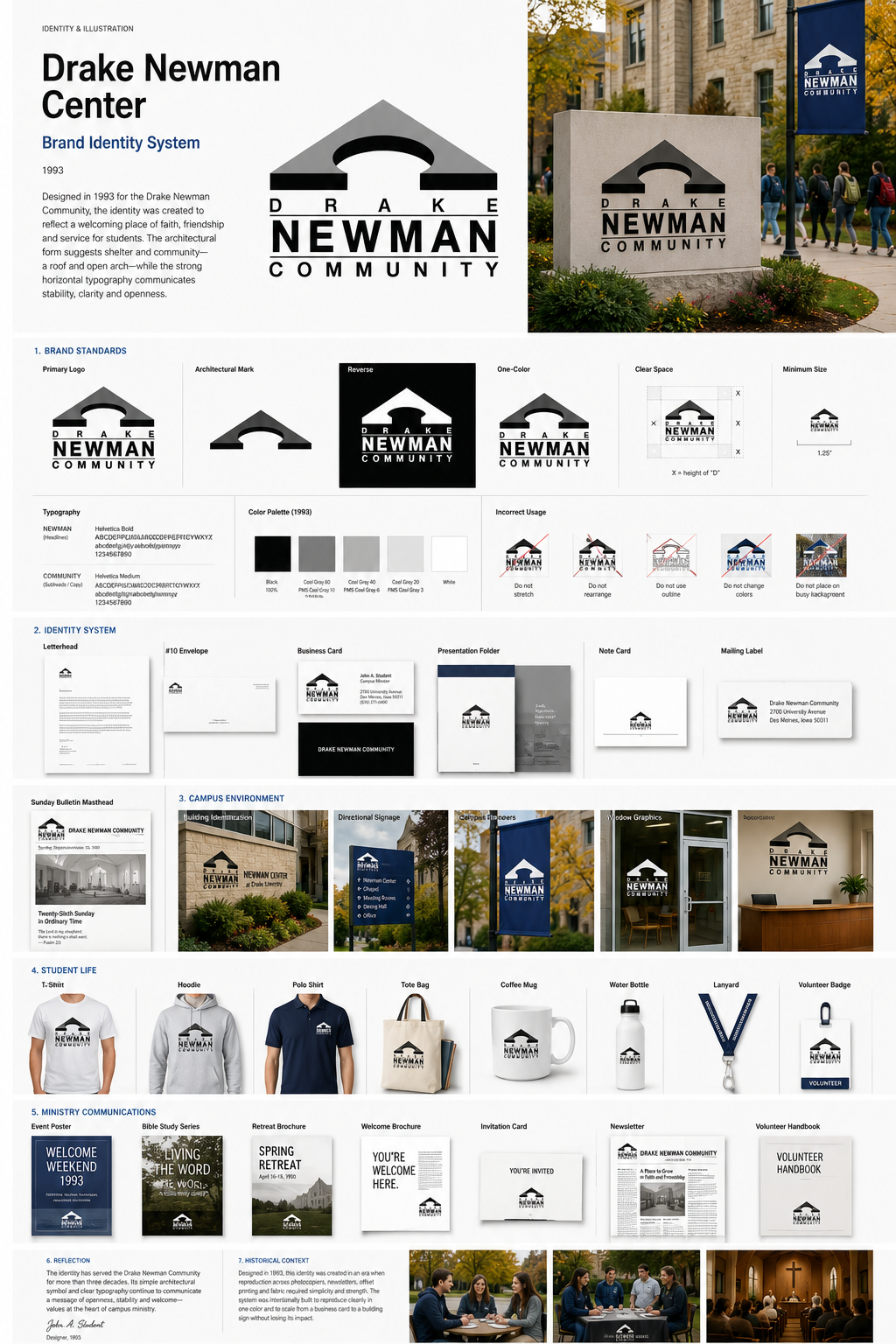
The Drake Newman Center identity was created in 1993 for a student-focused Catholic campus ministry community. The mark needed to communicate faith, welcome, stability, and openness without feeling overly formal or institutional.
The simplified architectural form suggests both shelter and community: a roof and open arch that could be read as a chapel, gathering place, or symbolic doorway. The stacked typography gives the identity structure and strength, while the wide letterspacing creates a calm, collegiate presence.
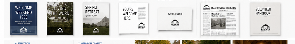
Because the identity needed to work across practical ministry needs, the system was designed to reproduce effectively on photocopied bulletins, office stationery, student apparel, campus signage, event posters, envelopes, business cards, and weekly communications.
Brand System
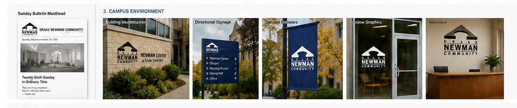
Identity Standards and Practical Applications
The identity system is shown across the types of applications most relevant to a campus ministry organization: printed communications, Sunday bulletin mastheads, campus signage, student apparel, event materials, and welcoming touchpoints for students and visitors.
The Mark
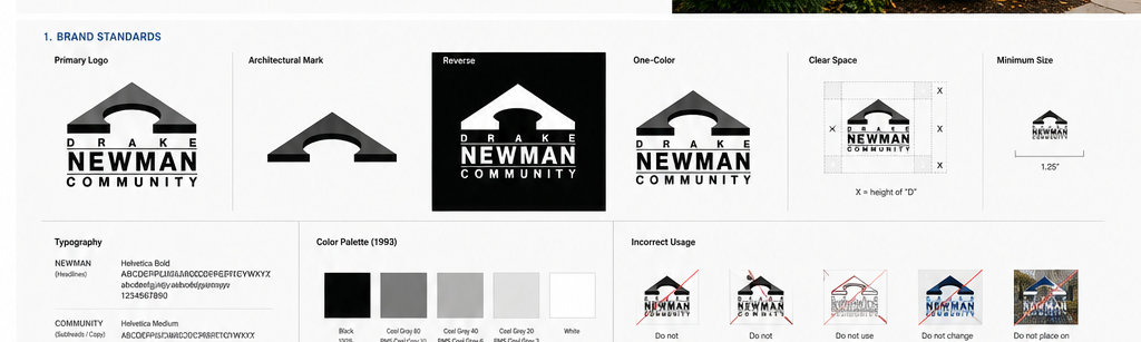
Logo Standards
In 1993, an identity needed to survive photocopying, fax transmission, offset printing, low-budget newsletters, campus signage, and embroidered apparel. The logo was built around a compact architectural symbol and high-contrast typography to preserve recognition across those production methods.
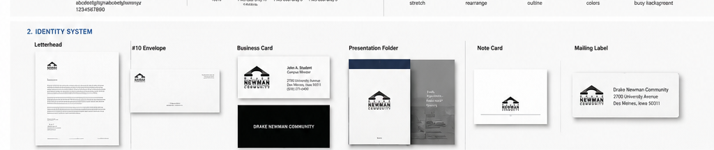
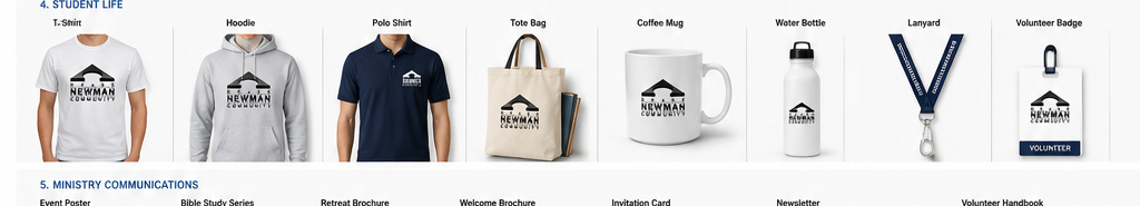
Identity Applications
Designed for Real Campus Use
The most important applications for the identity were practical: bulletins, stationery, envelopes, business cards, campus signage, student apparel, event announcements, and ministry communications that could be produced reliably on modest budgets.
Design Challenge
The identity needed to serve a student community rather than a corporate organization. It had to feel approachable enough for college students, stable enough for a faith-based ministry, and practical enough for the everyday production realities of the early 1990s.
Materials needed to be produced across a wide range of formats, including Sunday bulletins, photocopied handouts, campus posters, envelopes, business cards, newsletters, apparel, and signage. The logo therefore had to remain legible at small sizes, hold up in one-color reproduction, and still feel distinctive when enlarged for environmental use.
Design Approach
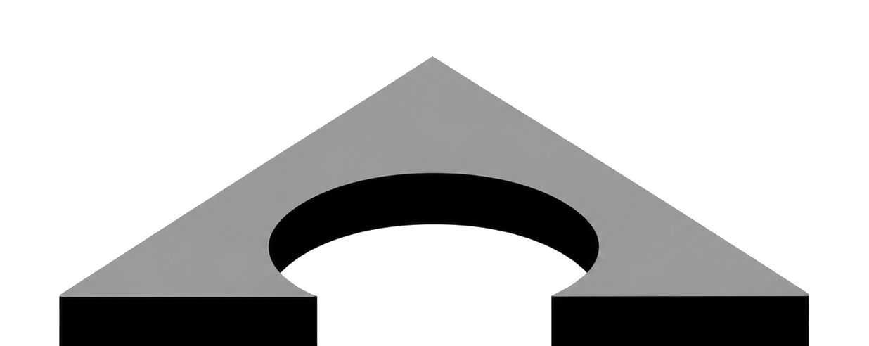
The mark was built around a simplified architectural silhouette. The triangular roofline creates a strong collegiate and institutional reference, while the open arch softens the form and suggests welcome, gathering, and passage into community.
The typography is intentionally direct and structured. Wide spacing across “Drake” and “Community” creates rhythm and quiet confidence, while the larger “Newman” word anchors the identity around the center's most recognizable name.
A restrained grayscale palette reflects both the era and the production environment. The identity could function in a polished presentation, but it was also designed to work on a copier, a bulletin masthead, an outdoor sign, or a student T-shirt without losing its essential character.
Project Highlights
- Designed a collegiate ministry identity with strong architectural symbolism
- Balanced faith, welcome, stability, and student-centered communication
- Created a mark that could reproduce effectively in one color and at small sizes
- Extended the identity across bulletin mastheads, stationery, signage, apparel, and ministry materials
- Preserved a timeless visual tone appropriate for a long-standing campus community
Historical Context
Designed in 1993, the Drake Newman Center identity reflects a period when student organizations and campus ministries relied heavily on printed bulletins, flyers, newsletters, photocopied handouts, and modestly produced event materials. A successful identity had to be visually memorable while remaining economical and technically reliable.
The simplicity of the mark gives it staying power. The architecture remains readable, the typography remains clear, and the overall identity still communicates openness, structure, and community decades later.
The strongest identity systems are not defined by how many effects they use, but by how well they endure across real situations.
Related Identity Projects
Continue Exploring
Additional identity systems exploring corporate communications, institutional branding, industrial marks, and practical real-world brand applications.